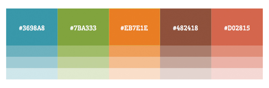
I’ve been asked to turn in my color palette so that we can all discuss it. I’ve mentioned this before, but my thinking behind my color palette is to be “bright earthy.” Blue is representative of the sky; green is grass and plants; orange is from plants and the sunset/sunrise; brown is dirty; and the salmon color is mostly a highlight color that rounds out the palette.
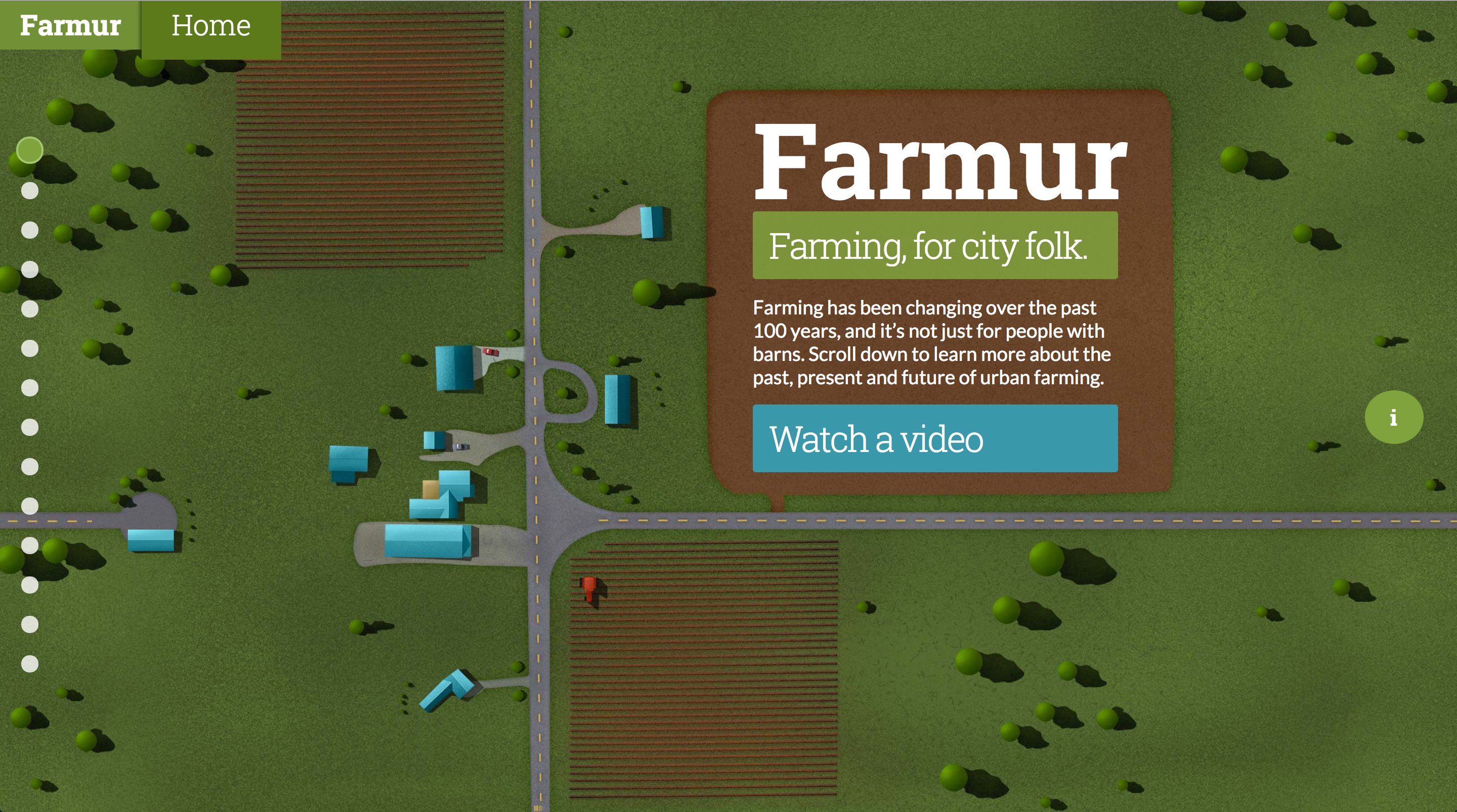
I’ve been reducing the amount of colored boxes on the page, and I introduced a new idea where the text sits in the illustration. For example, the home page now has a giant field (mostly dirt) that the logo and introduction text actually sits in.