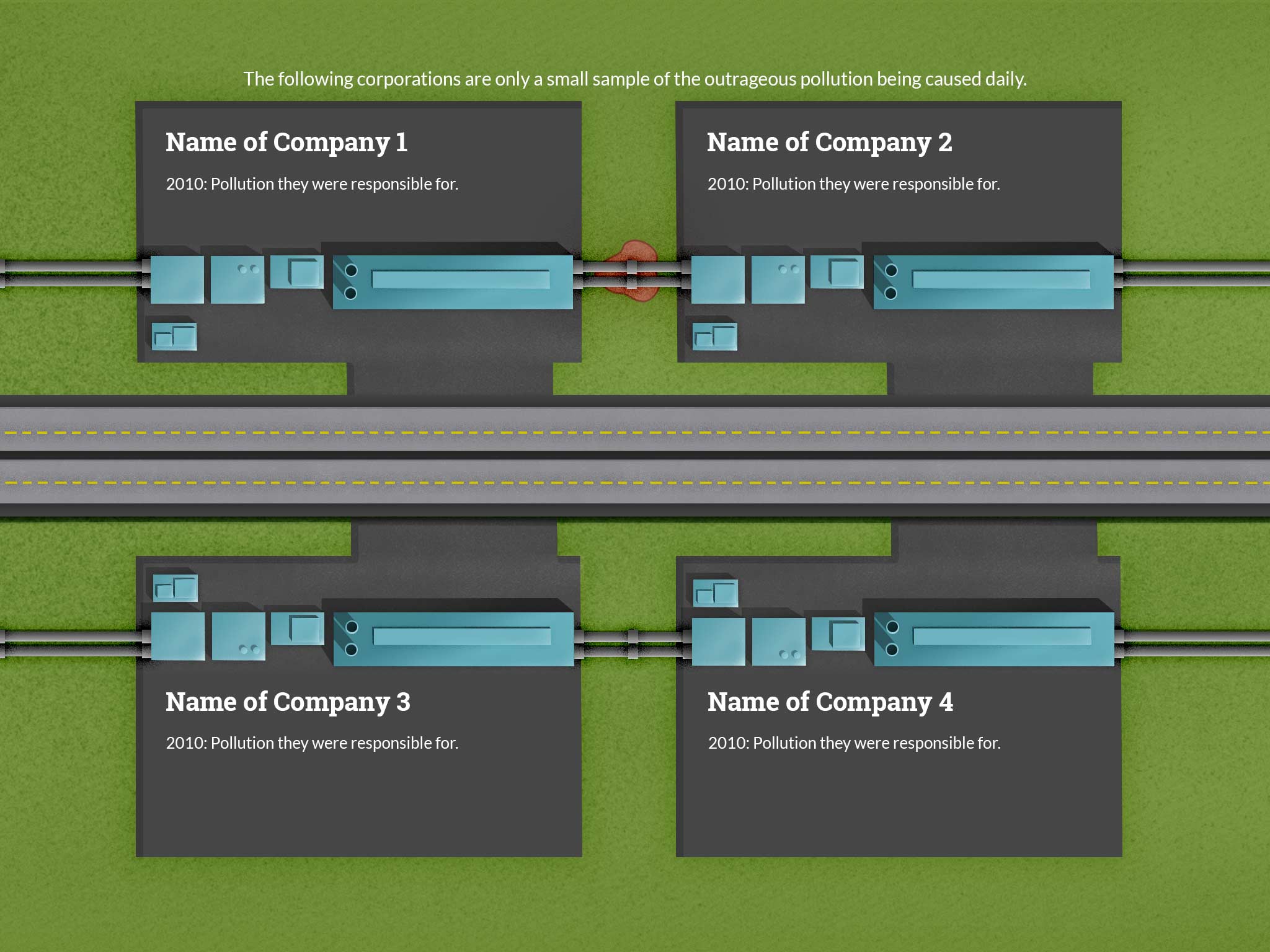
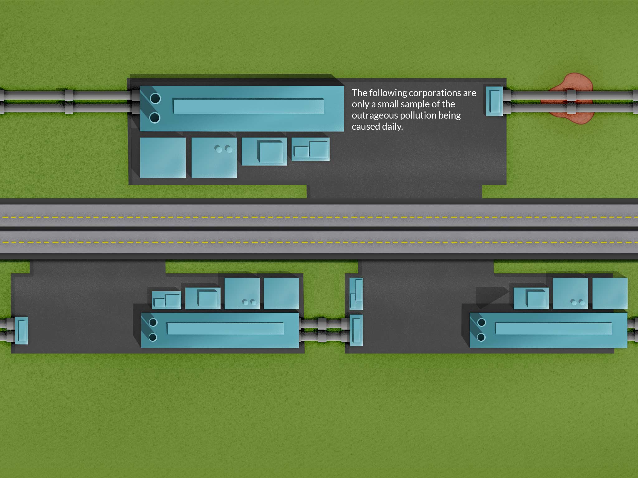
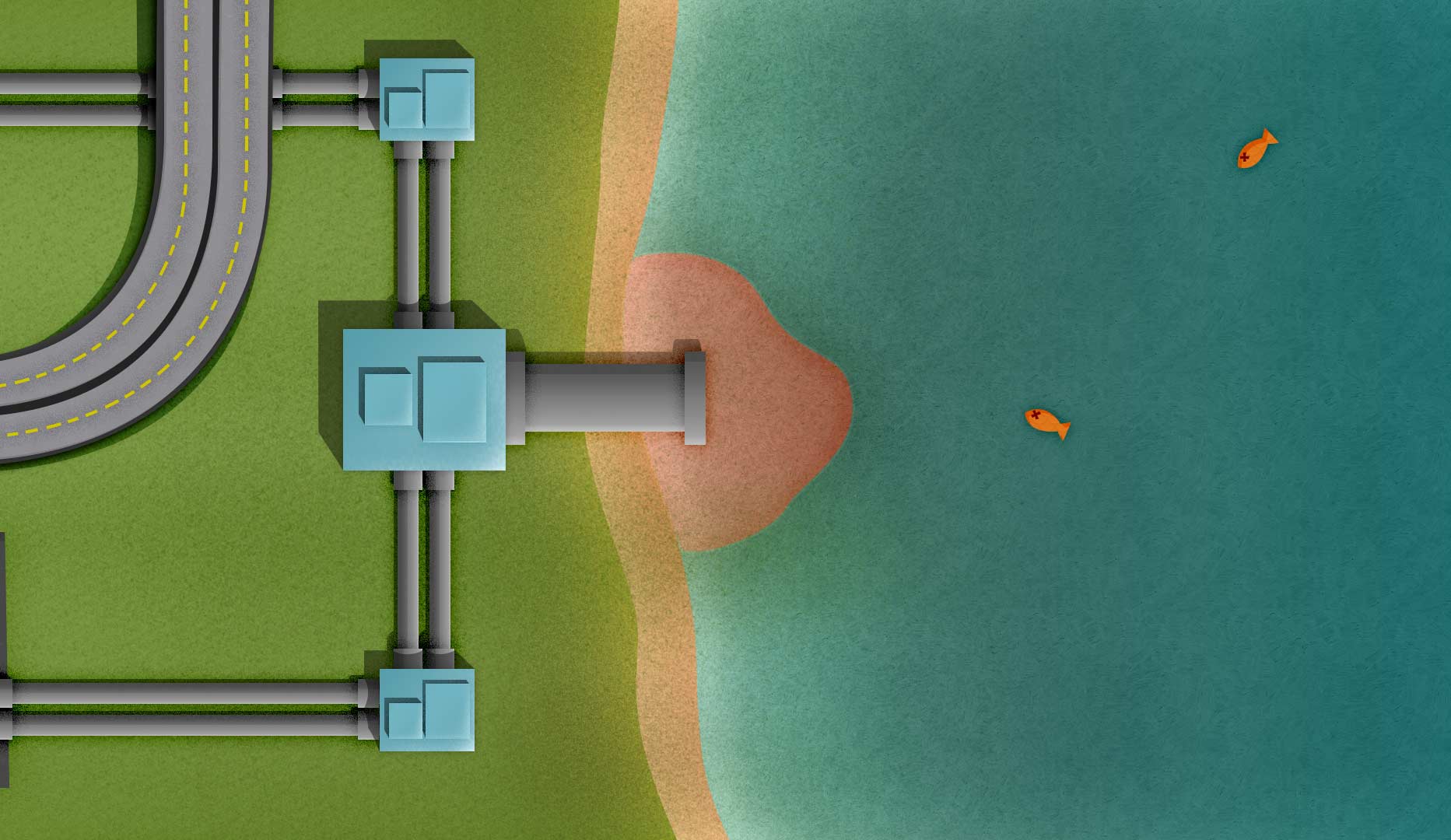
This week I’m trying to figure out the best way to show companies and their pollution. I’ve gone through a few placement ideas, but they all have some limitation. On top of all that, I’m trying to make everything repeatable, which adds a layer of complexity. One section, with a giant polluted lake was supposed to contain an interactive infographic, but the new hierarchy just isn’t making sense. The original design was running top to bottom, but now it’s running left to right. I’ll need to think about what information is absolutely necessary in order to make sure the message is very clear.
Below you can see a few illustrations I created to communicate the benefits of urban farming: