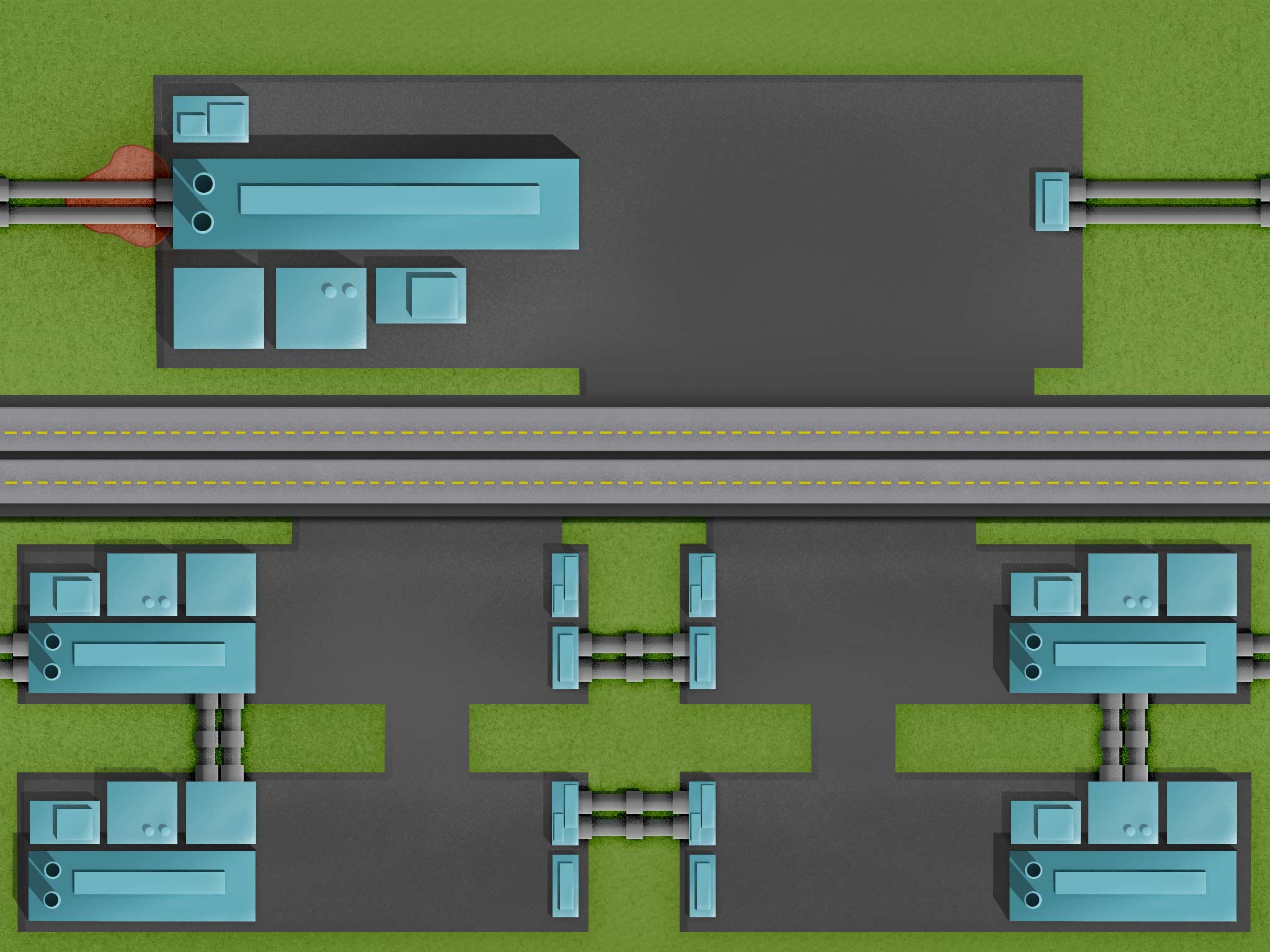
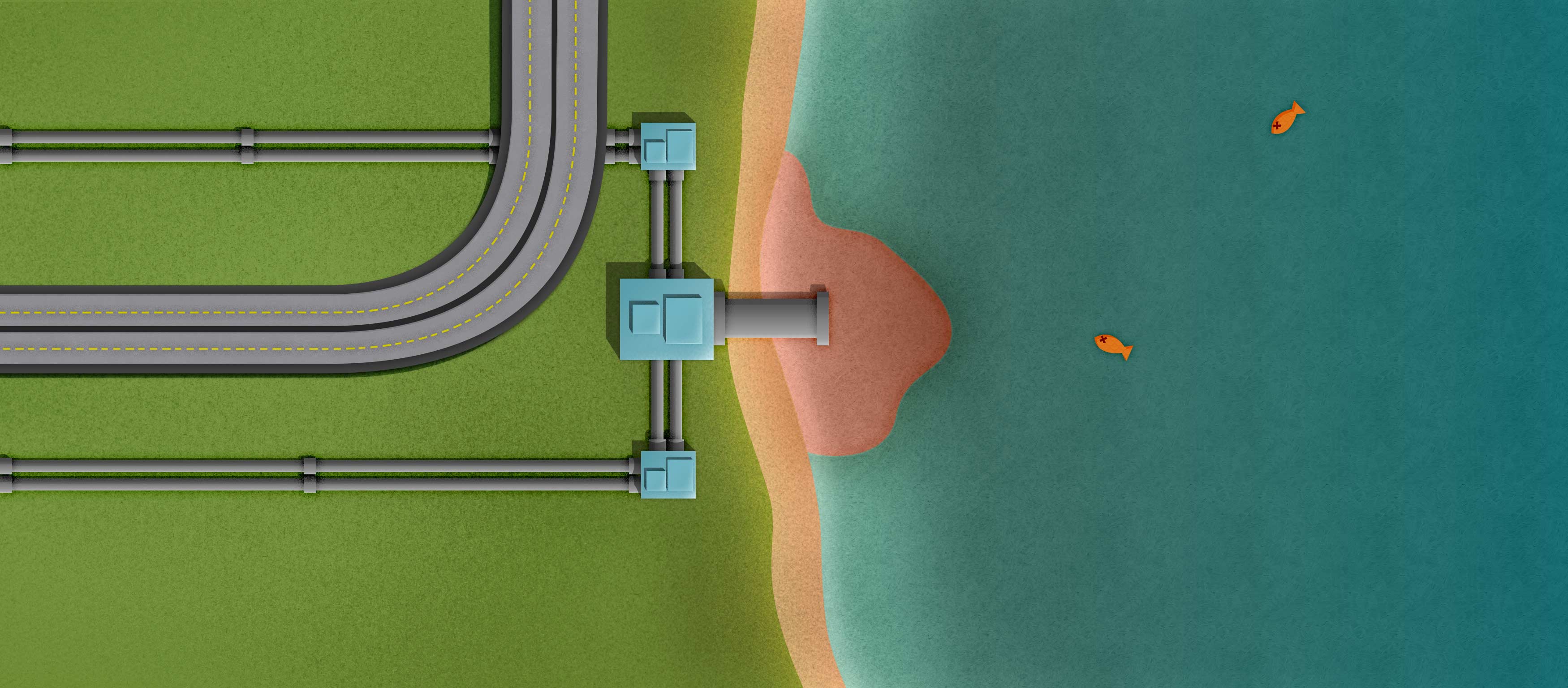
I was able to decide on how to show the corporation and pollution page. Up top, there will be a more prominent company name with a longer description. Underneath, there will be four smaller companies with short descriptions of what pollution they have been in trouble for causing. Also, I lengthened the polluted lake page so I could cover the fact that it can’t be tiled like the other images.
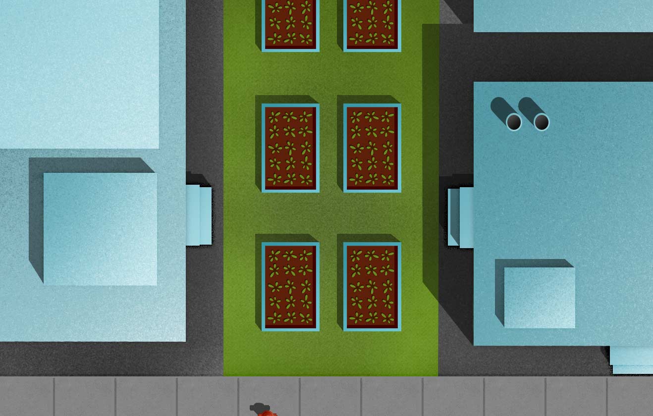
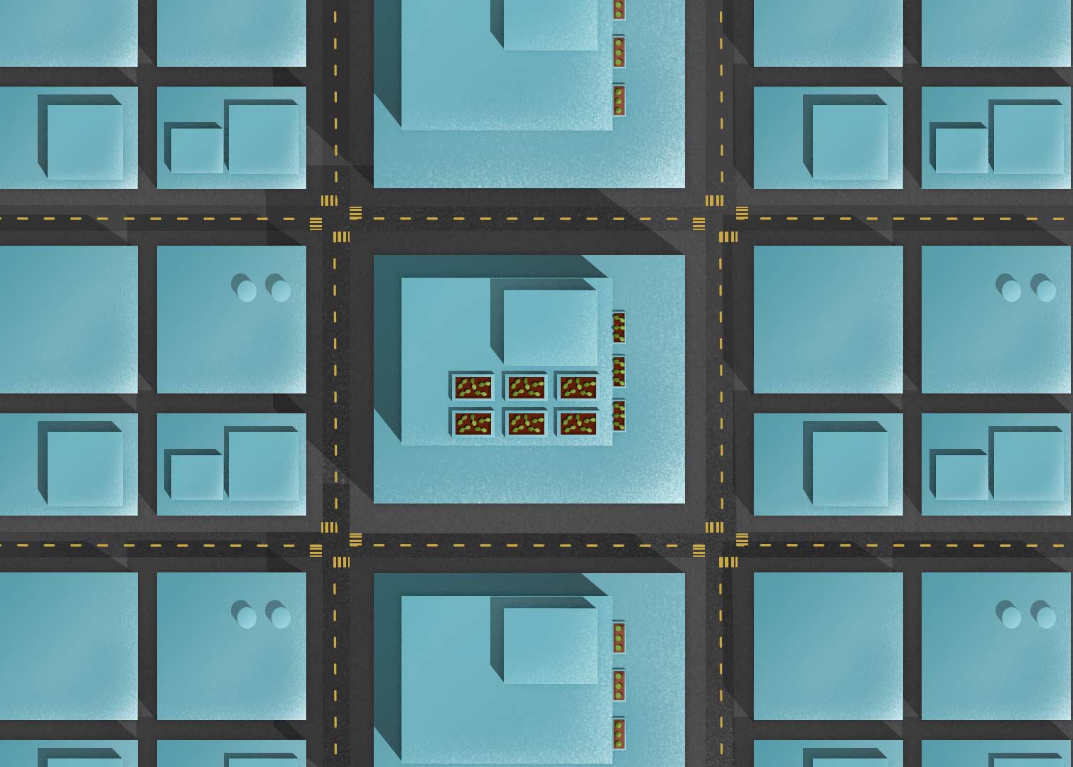
I’m posting a few elements below that I’ve been exporting to use in the web site. You can see different size urban farms, the current logo, and a family under water from food costs. I was told that the family seems out of place in my illustrations, but I haven’t found a solution yet.