This is the presentation used for both of my classes. I’m nearing the end of my career here at AAU, and this is a pretty clear indicator of where I currently am in the program and what my final presentation would look like if I presented today. I forgot to update the date, but the presentation is updated.
Category Archives: Visual Design
Visual Design – Week 14
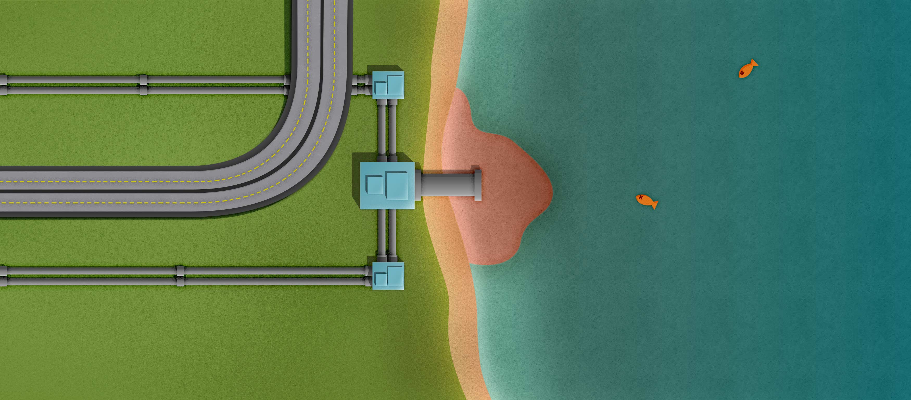
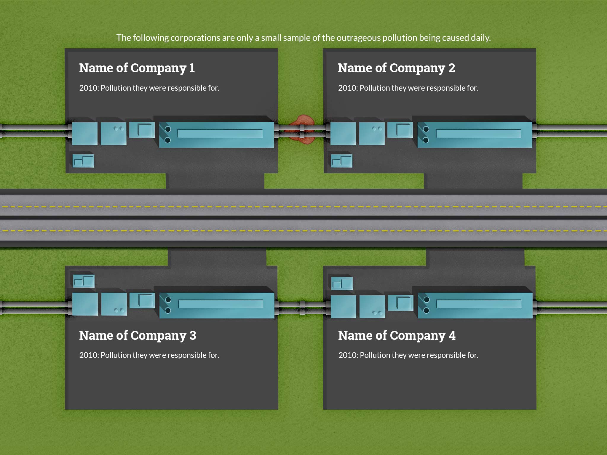
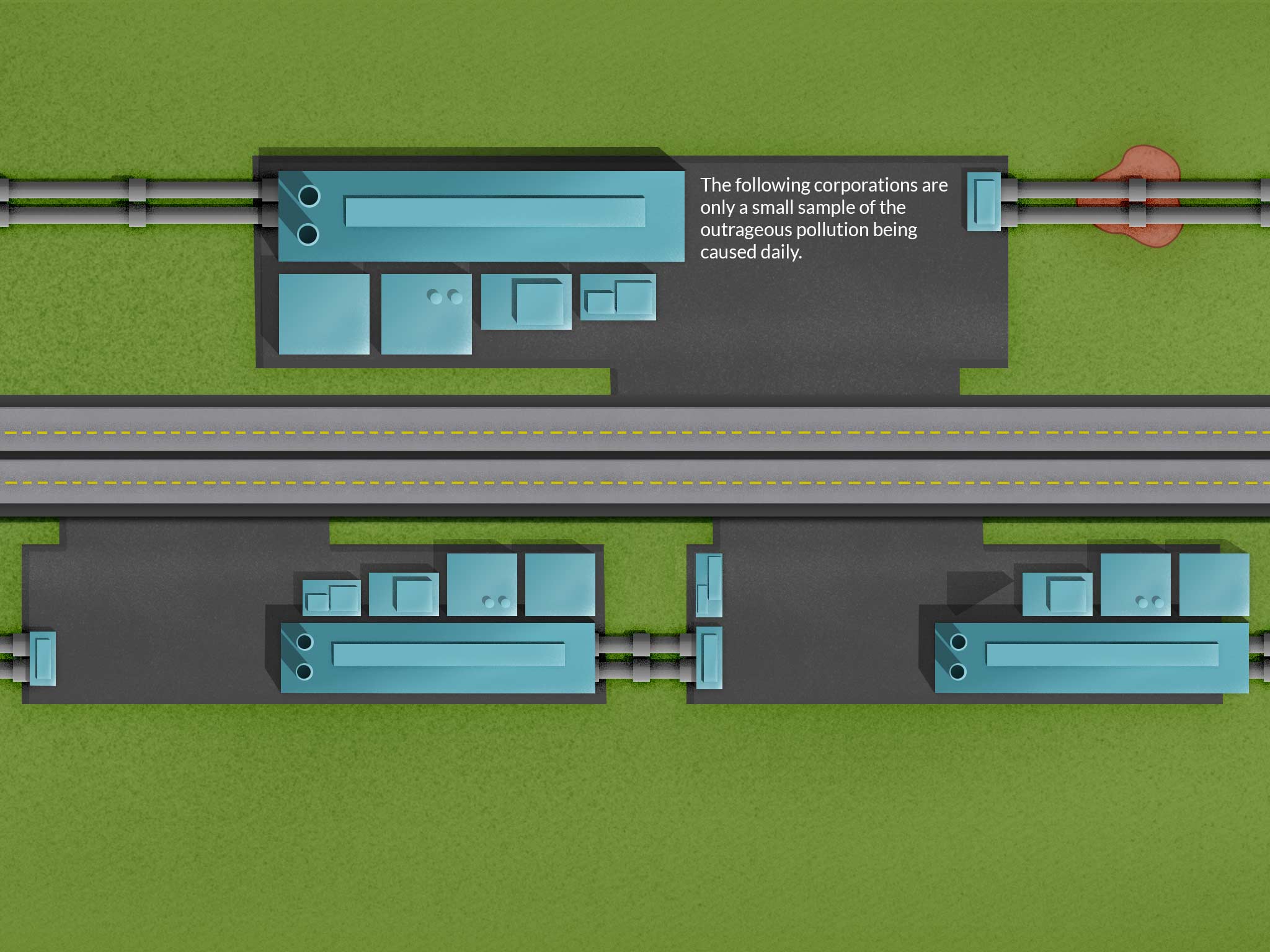
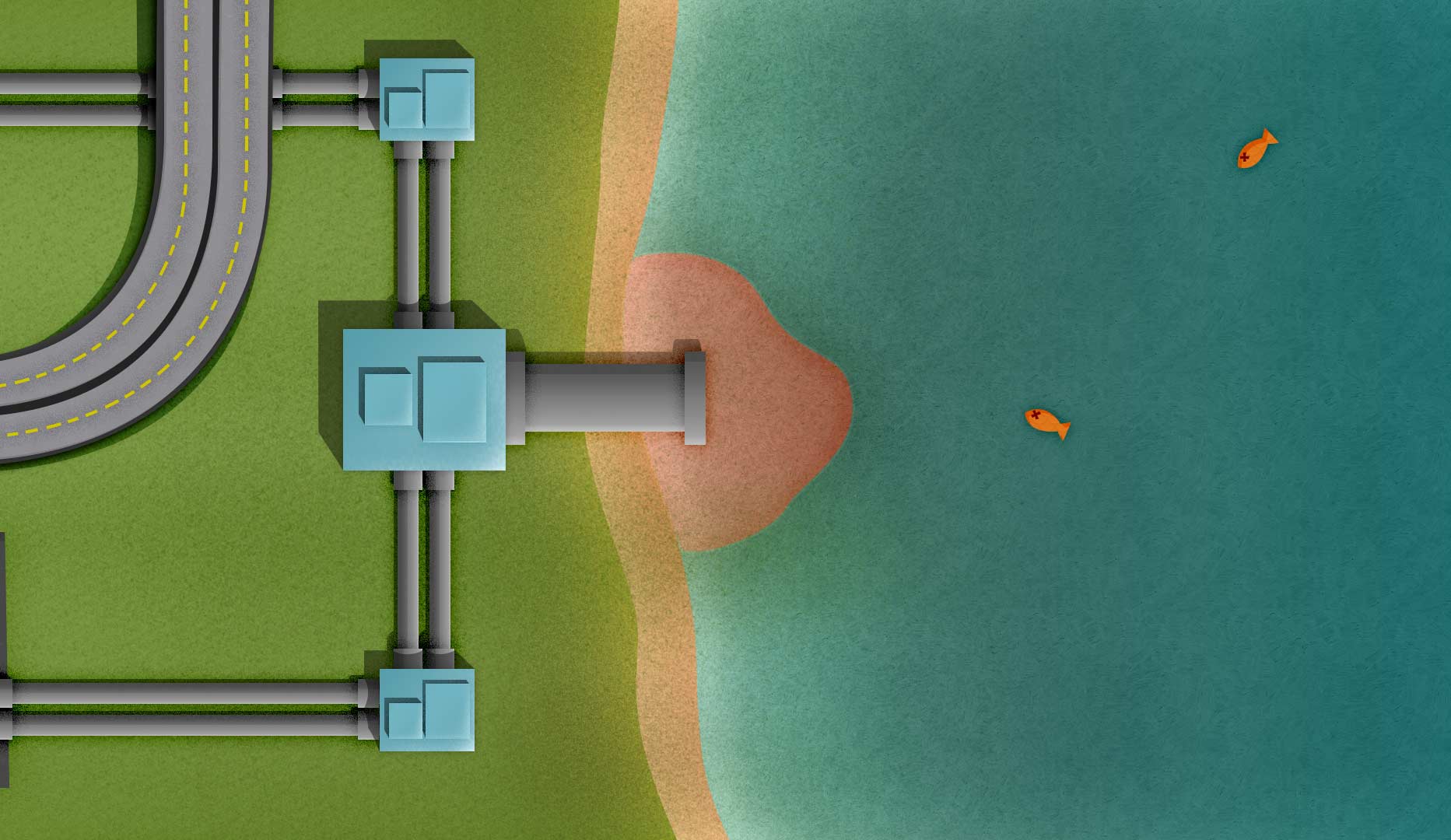
I was able to decide on how to show the corporation and pollution page. Up top, there will be a more prominent company name with a longer description. Underneath, there will be four smaller companies with short descriptions of what pollution they have been in trouble for causing. Also, I lengthened the polluted lake page so I could cover the fact that it can’t be tiled like the other images.
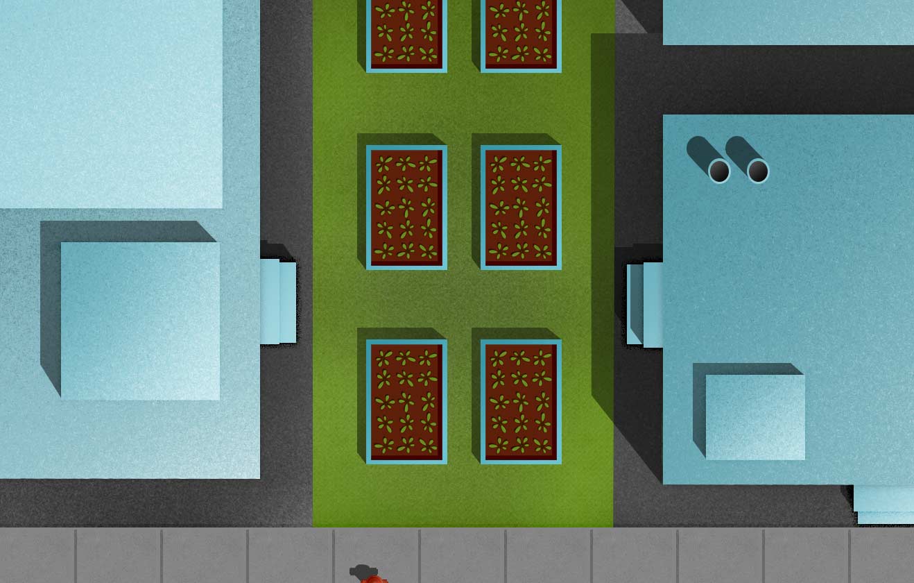
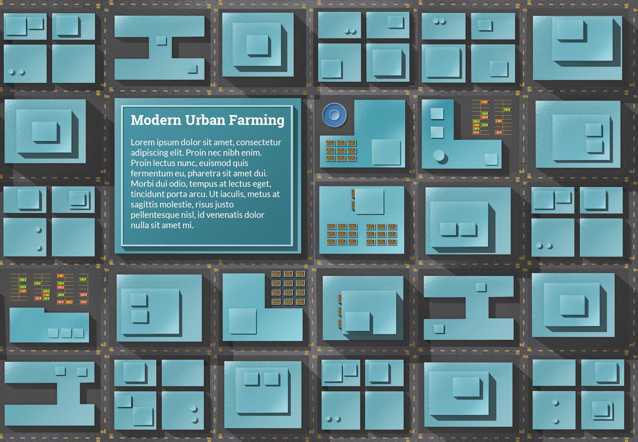
I’m posting a few elements below that I’ve been exporting to use in the web site. You can see different size urban farms, the current logo, and a family under water from food costs. I was told that the family seems out of place in my illustrations, but I haven’t found a solution yet.

Visual Design – Week 13
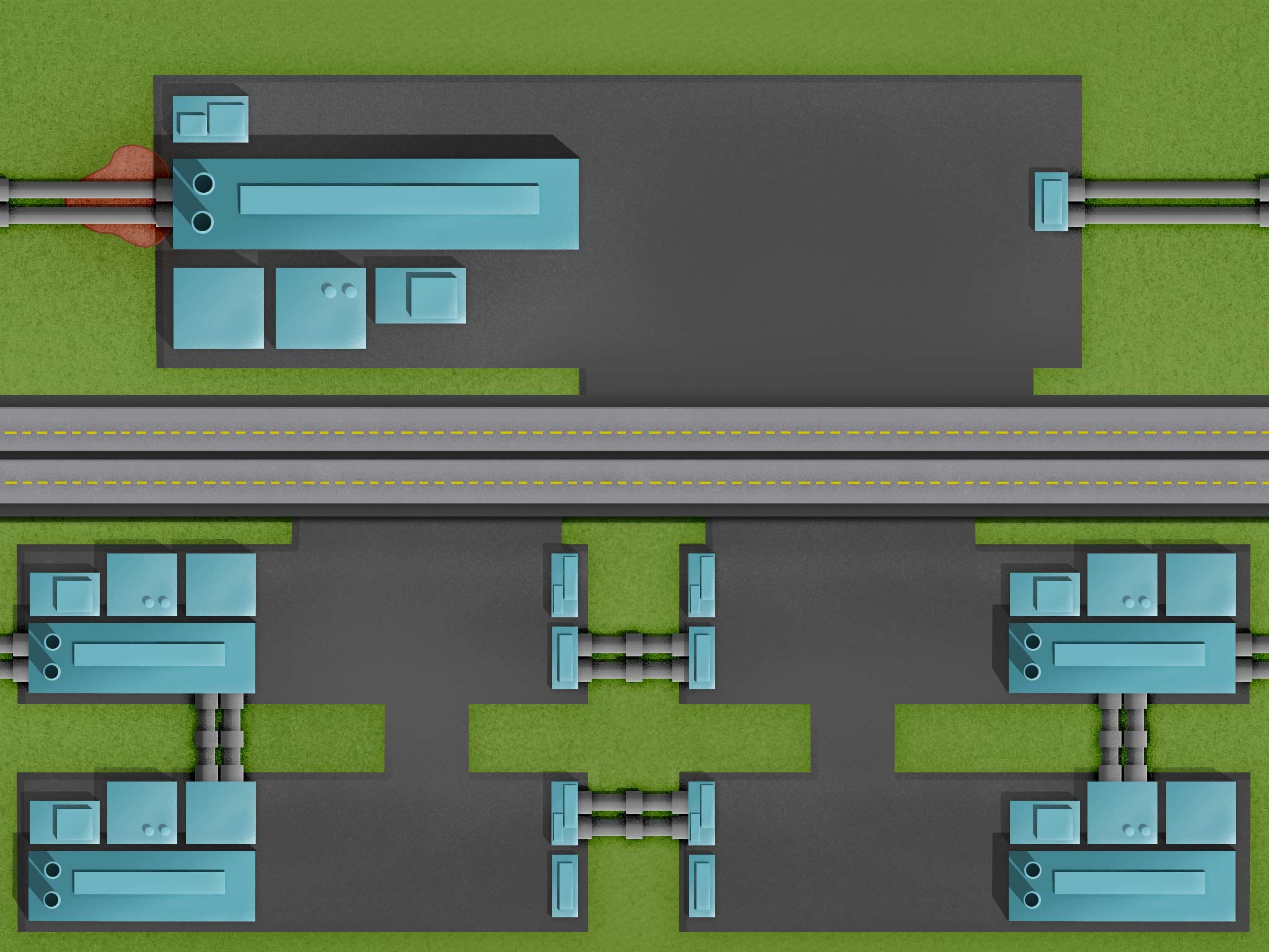
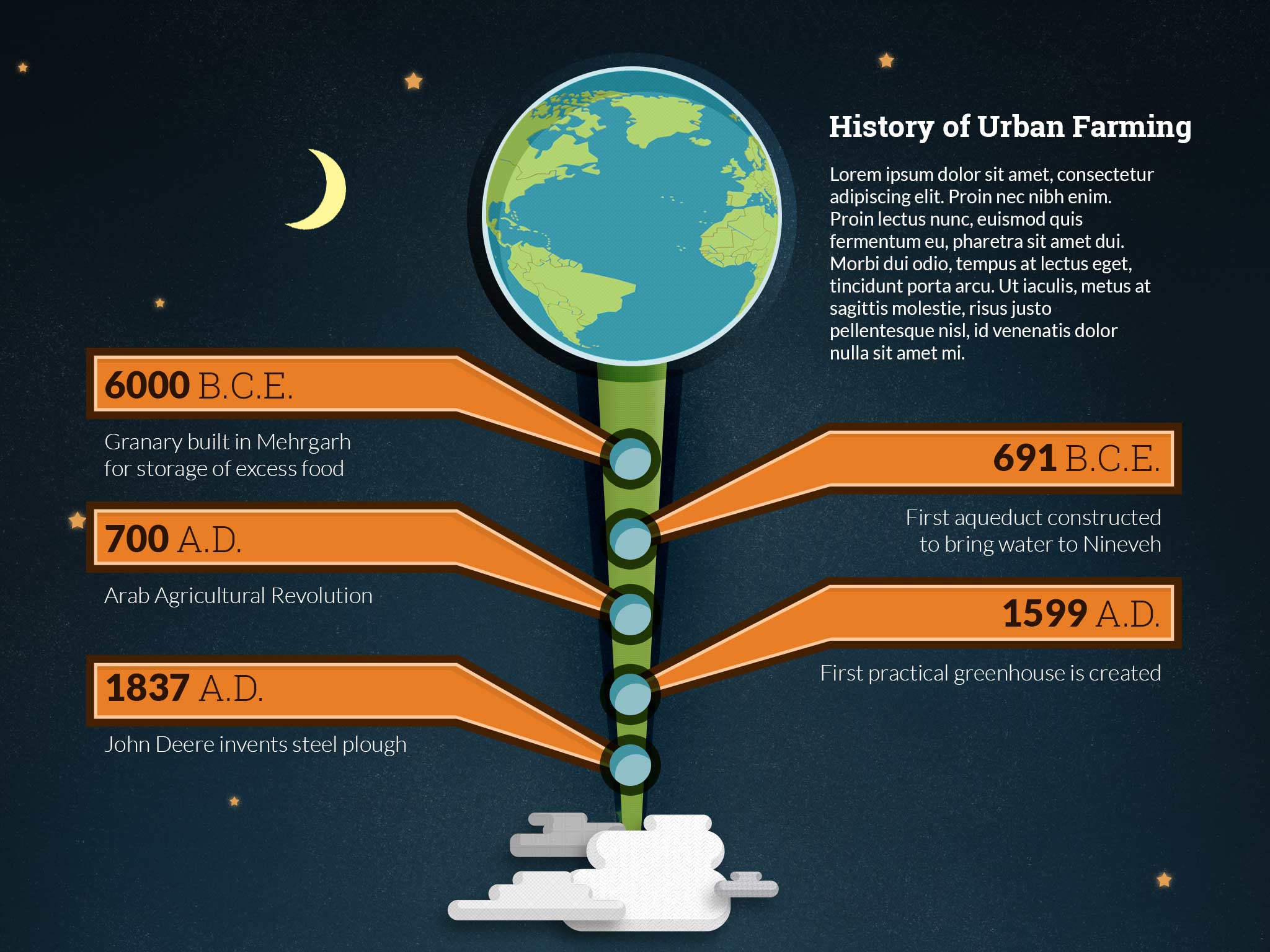
This week I’m trying to figure out the best way to show companies and their pollution. I’ve gone through a few placement ideas, but they all have some limitation. On top of all that, I’m trying to make everything repeatable, which adds a layer of complexity. One section, with a giant polluted lake was supposed to contain an interactive infographic, but the new hierarchy just isn’t making sense. The original design was running top to bottom, but now it’s running left to right. I’ll need to think about what information is absolutely necessary in order to make sure the message is very clear.
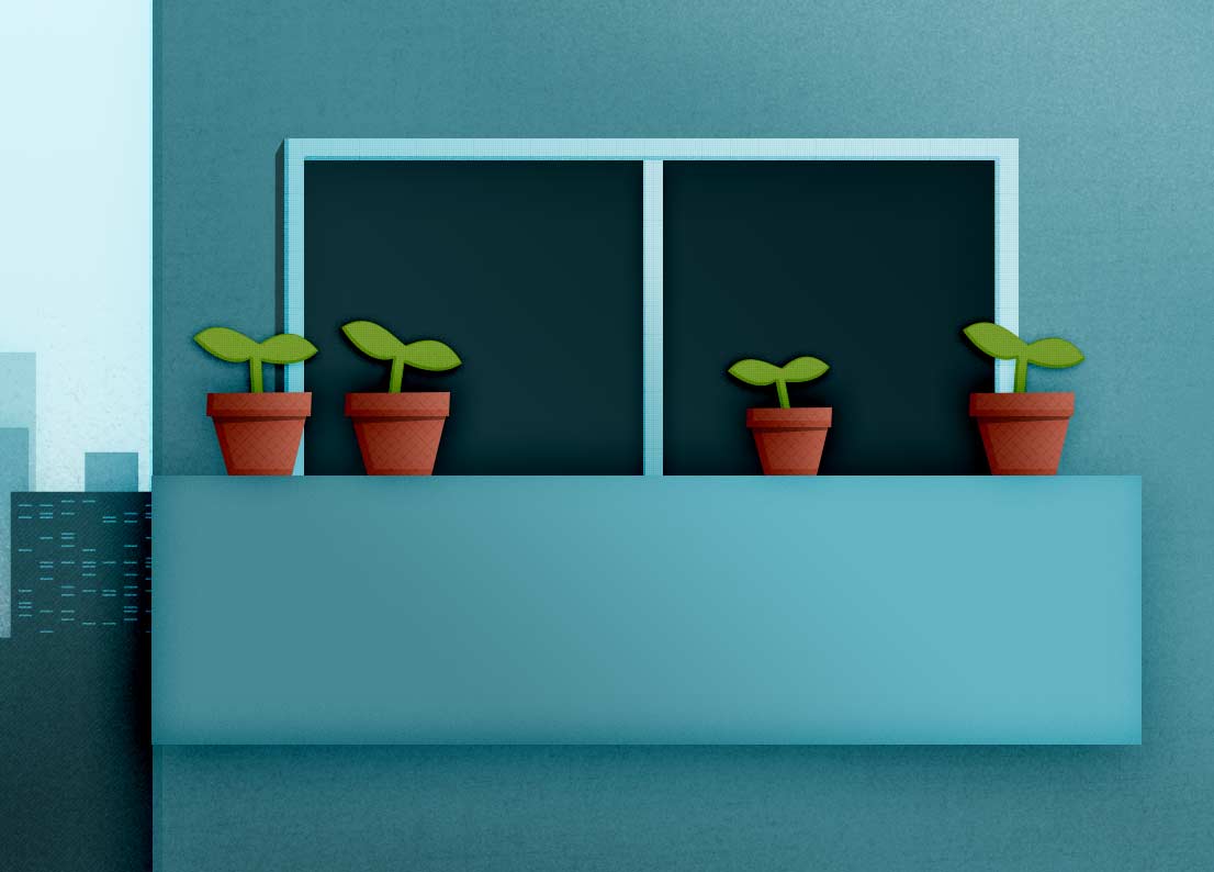
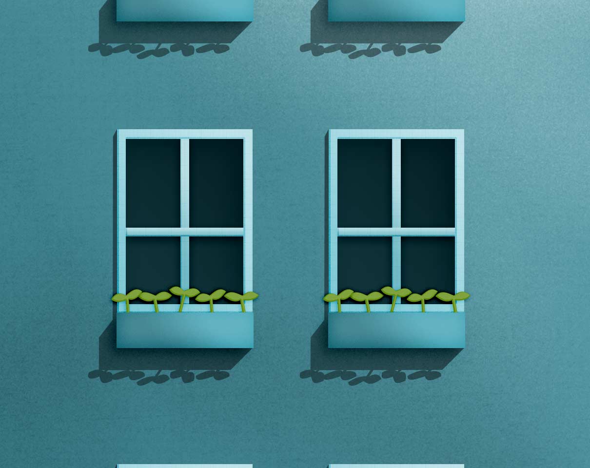
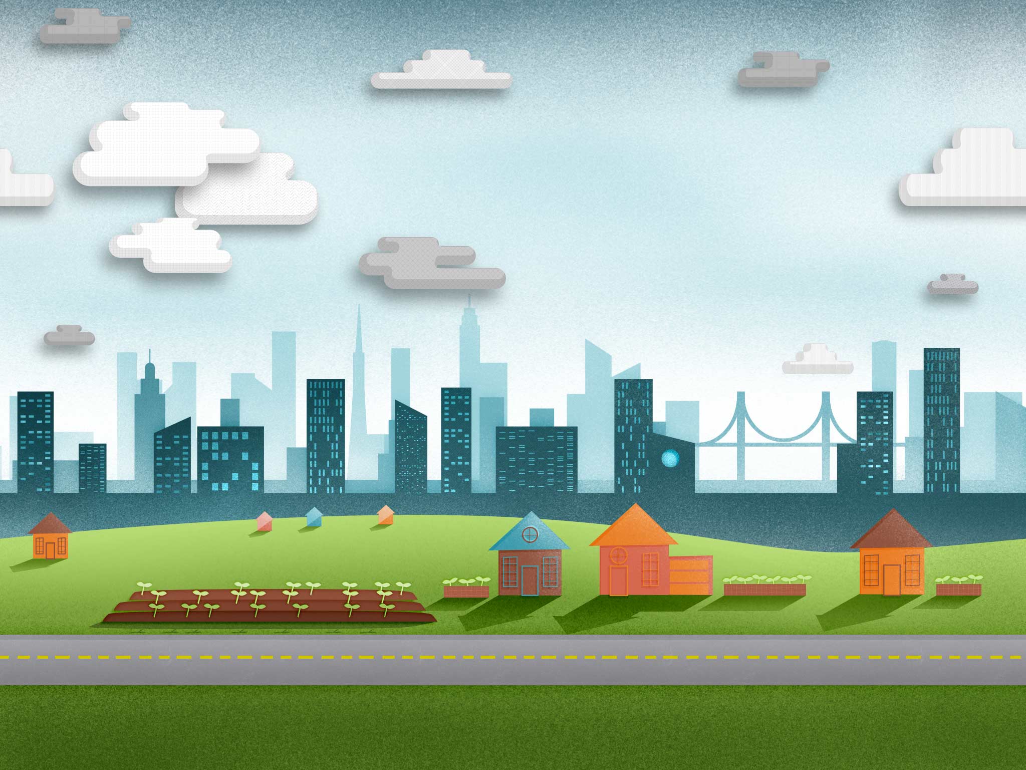
Below you can see a few illustrations I created to communicate the benefits of urban farming:


Visual Design – Week 12
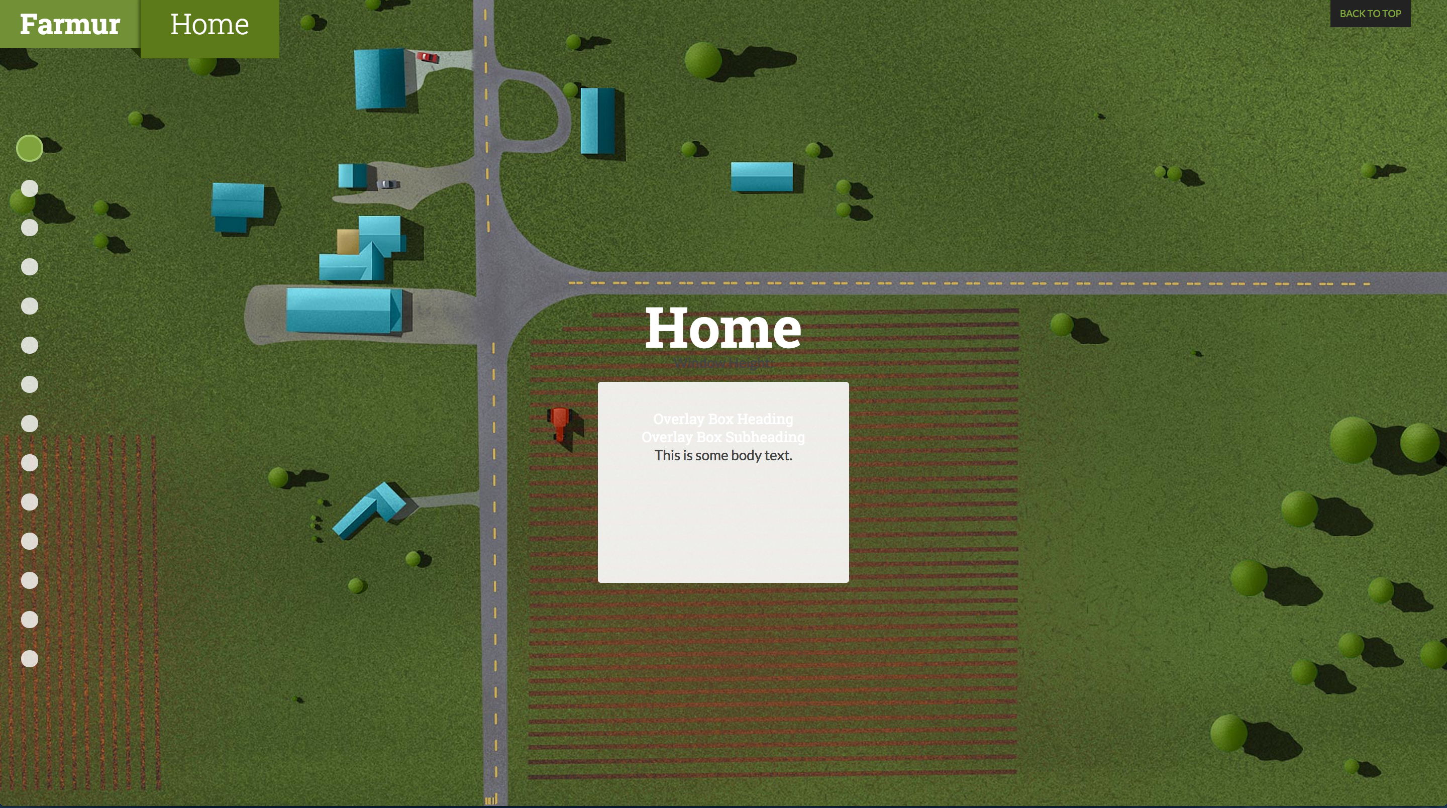
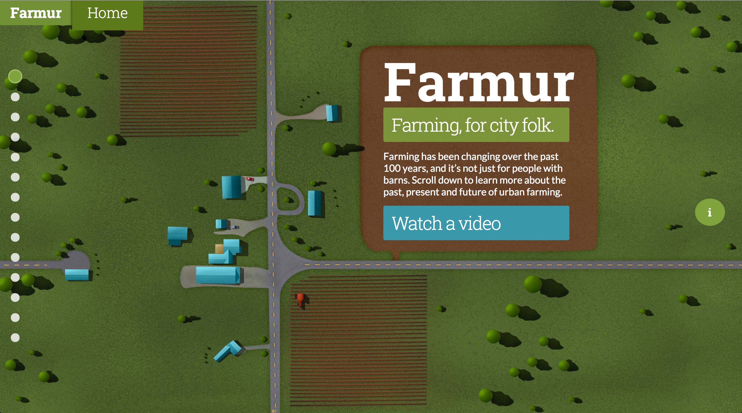
Still working on making specific pages repeatable. My home page saw a minor update; the dirt around the text was resized to make a more square shape around the logo and introduction paragraph.
Visual Design – Week 11
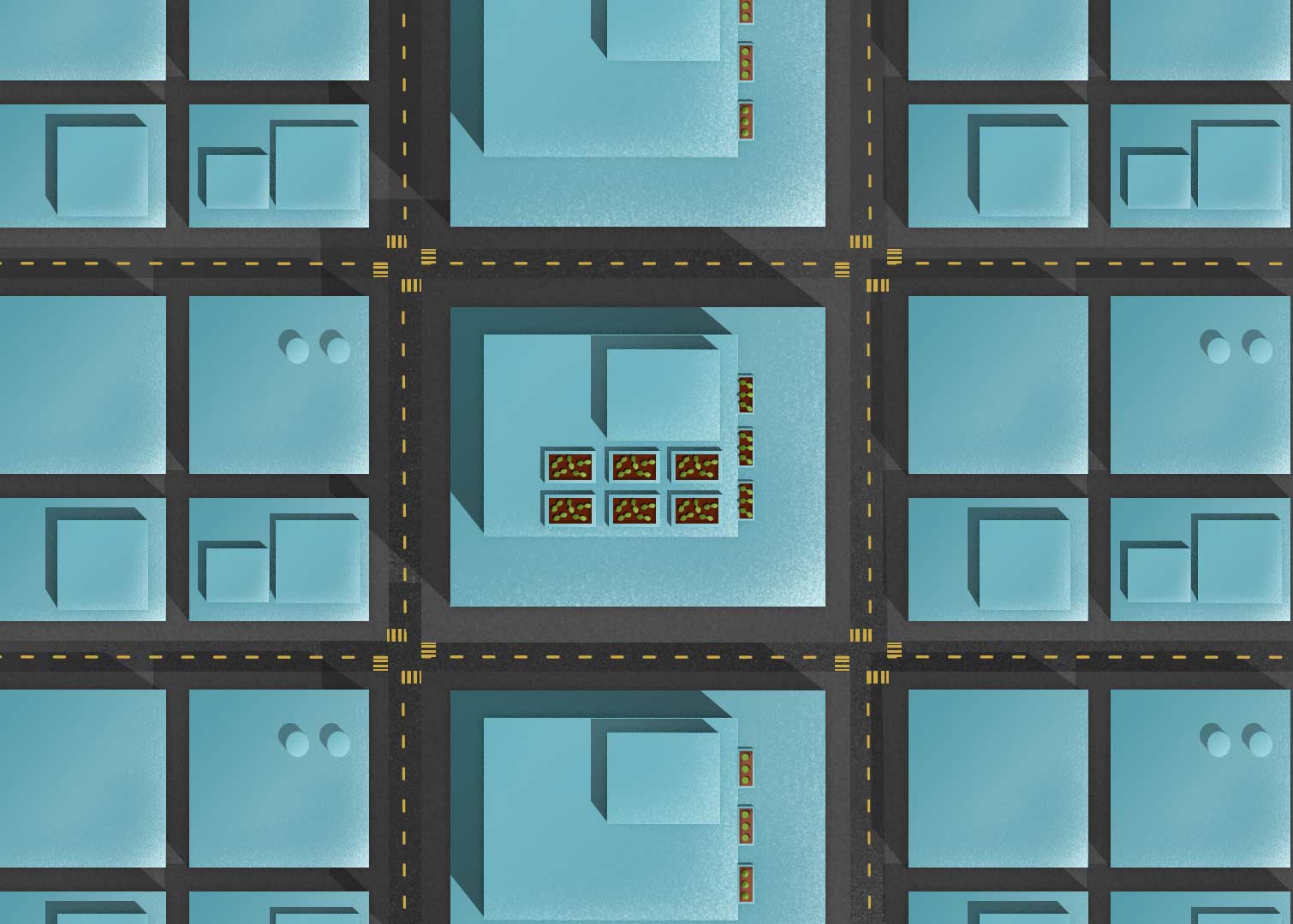
This week I spent a lot of time on making things repeatable on both the left and the right. The illustrations also should appear continuous as you flow up and down. This takes an incredible amount of effort to make full page illustrations that are tiled patterns. My process involved using Offset in Photoshop, and patching the newly created center line. Once the center line was painted out, I used Offset again to move the image back to where it was. Now that the edges fit repeated I took all the images and lined them up on top of each other. With this really long image I started painting the transitions between them to make the flow feel like one continuous illustration. Now, if someone resizes the window, the illustration won’t appear broken, it will all flow seamlessly together.

Visual Design – Week 10
This week included lots of planning around implementing future animations. There aren’t much visual elements to present this week since I’m just planning, but there will be plenty next week. I plan to make all the sections I can into repeatable patterns, so each current section needs to be revised into a seamless pattern on the left and right sides.
Visual Design – Week 9
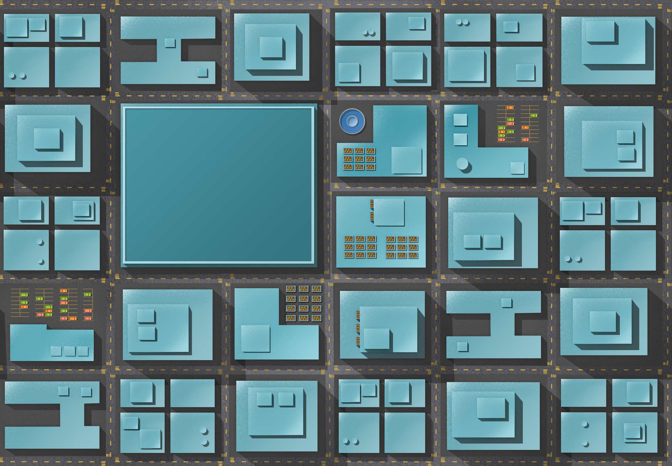
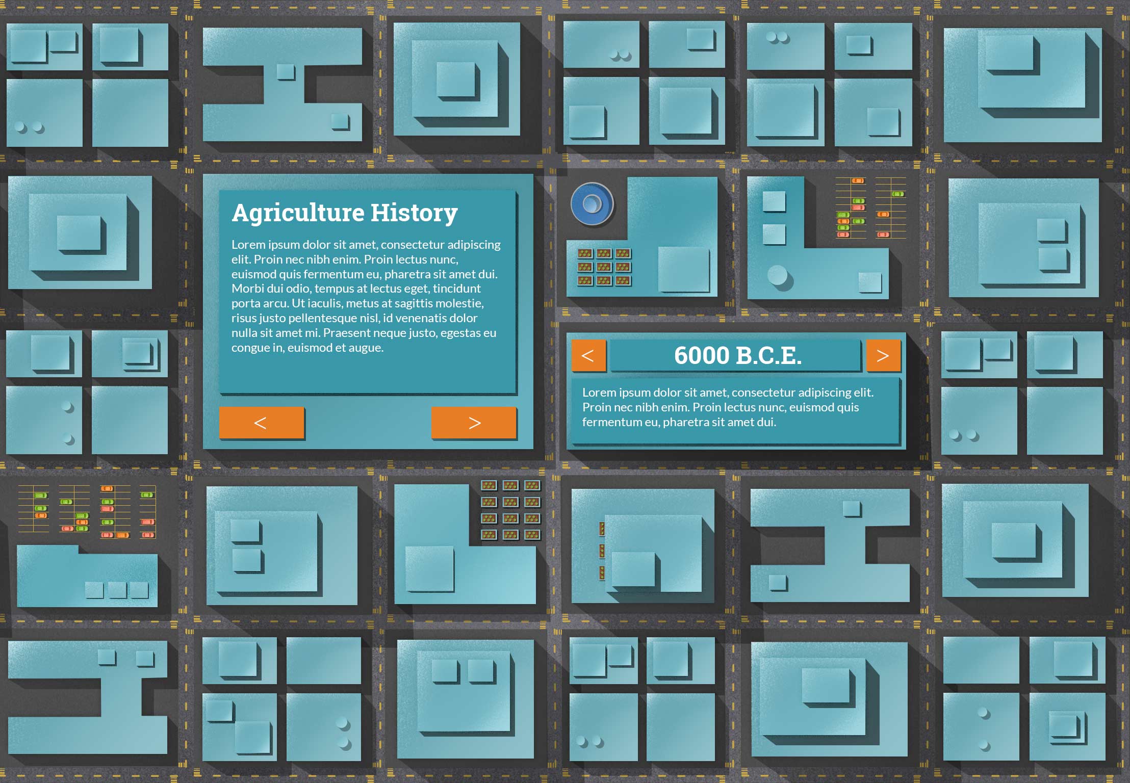
I’ve created some new pages and tightened up the side navigation. With the navigation, the height was to long, so I decreased the space between them. On the second page with buildings I created a place where text could sit on top of a really large building and removed all the slideshow elements. The slideshow elements are now on a separate page and will provide an opportunity to animate elements when the page appears.
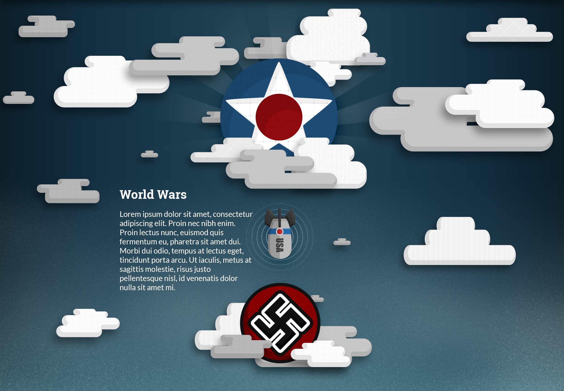
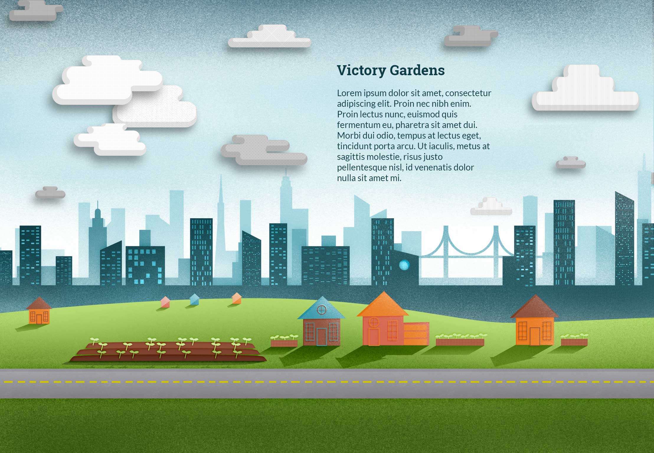
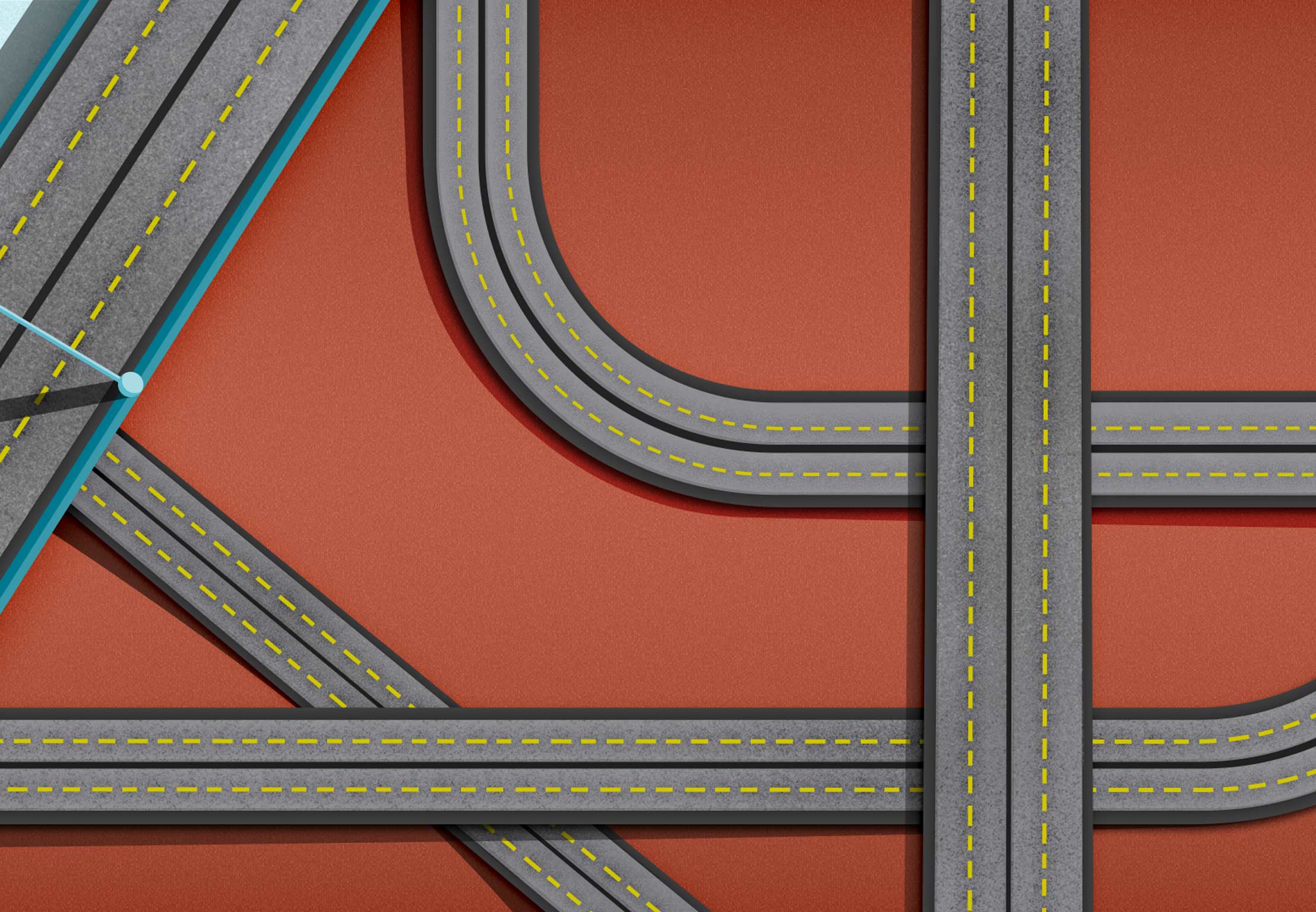
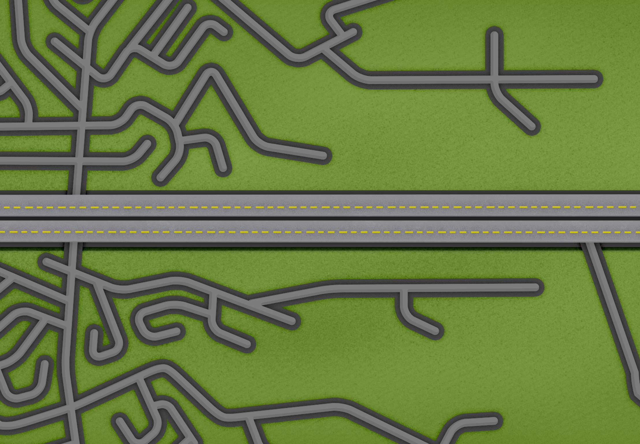
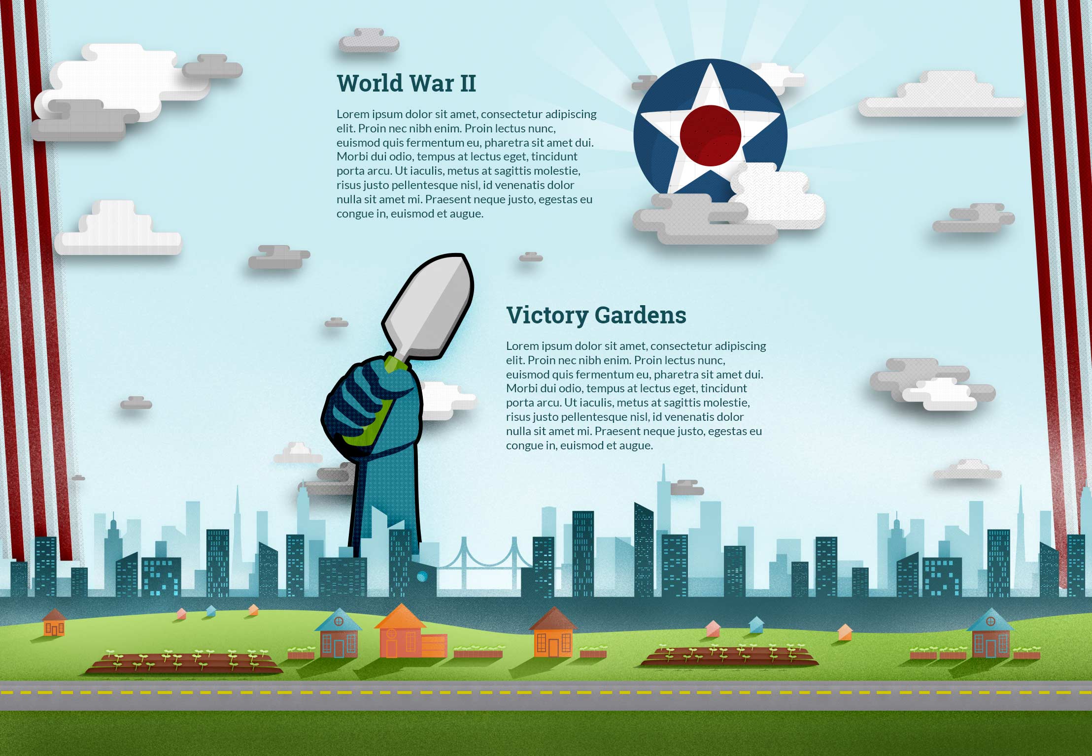
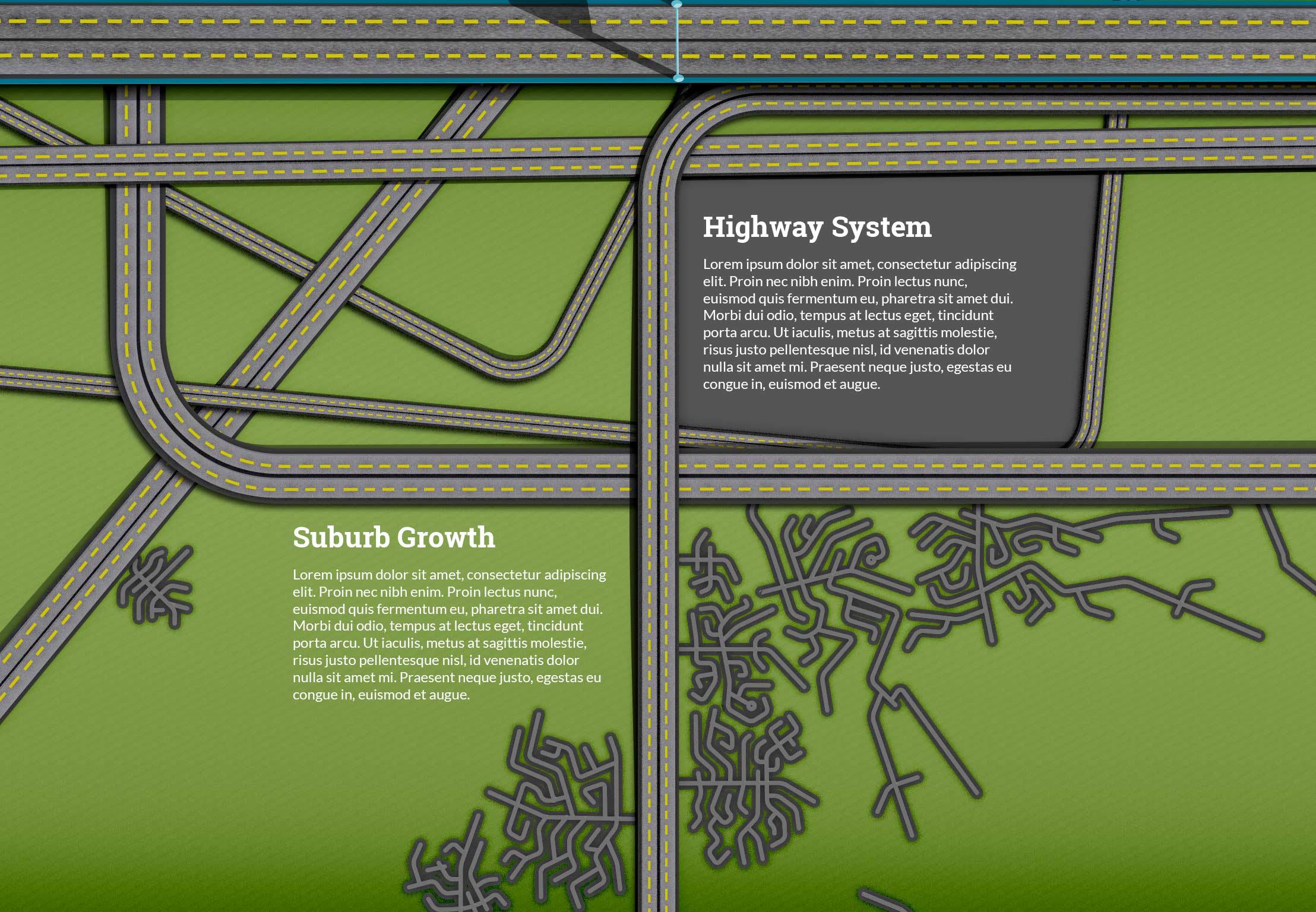
The World Wars and Victory Gardens are now separate pages and the World Wars now have a separate page. New pages include the Suburbs and Highway System. You can see all the old designs before breaking them into separate pages at the bottom of the post.
Textures I’m using courtesy of Subtle Patterns:


Visual Design – Week 8
In my continued attempt to integrate the type into the illustrations, I created a building/slideshow hybrid that people can eventually flip through the different text. My thought is that I can create a fun flipping animation to look like a building flipping over in 3D space. Actually coding this may prove to be quite the challenge.
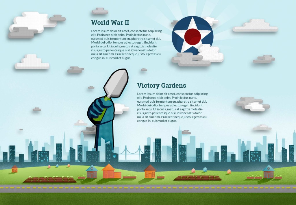
You can see below my first attempt at the World War II & Victory Garden page, but it just doesn’t have the impact the other pages have. Feedback I received had to do with “scale.” I need to make things bigger because the focus is too spread out. If I increase the size of the main focus, then it will help feel more impactful.
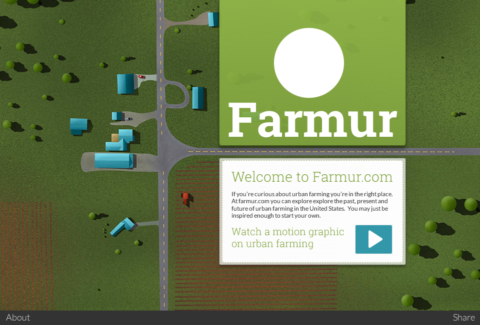
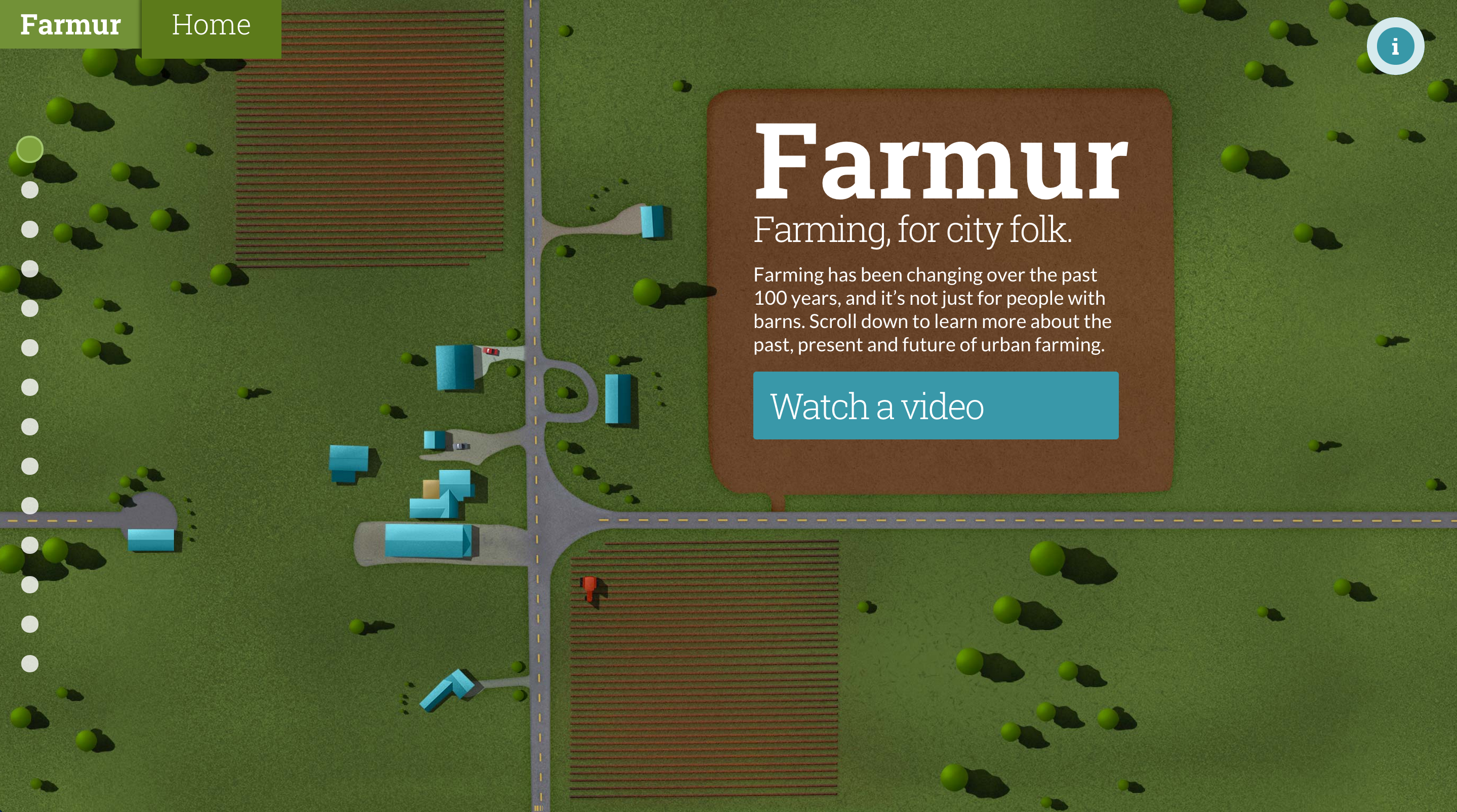
My saga with the homepage continues with color changes and repositioning of the “information” button. I also changed the body font weight and removed another color box. I think I will on have solid color elements be buttons from here on out.
Visual Design – Week 7
I’ve been asked to turn in my color palette so that we can all discuss it. I’ve mentioned this before, but my thinking behind my color palette is to be “bright earthy.” Blue is representative of the sky; green is grass and plants; orange is from plants and the sunset/sunrise; brown is dirty; and the salmon color is mostly a highlight color that rounds out the palette.
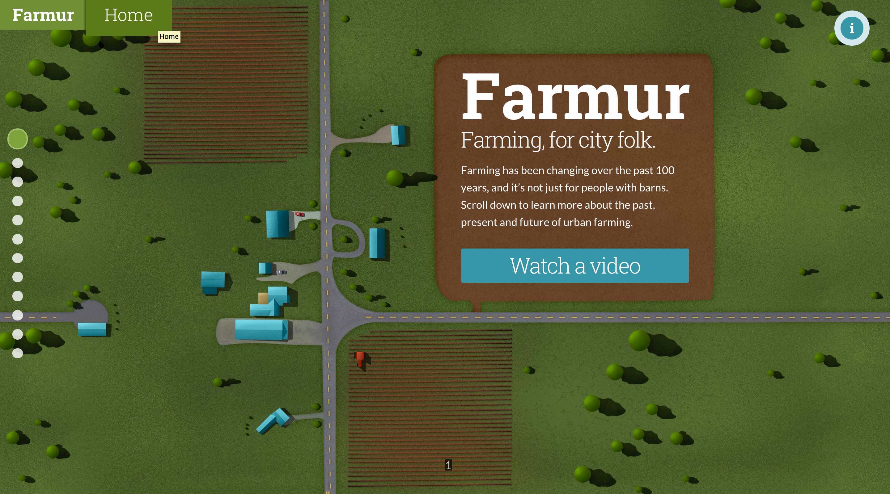
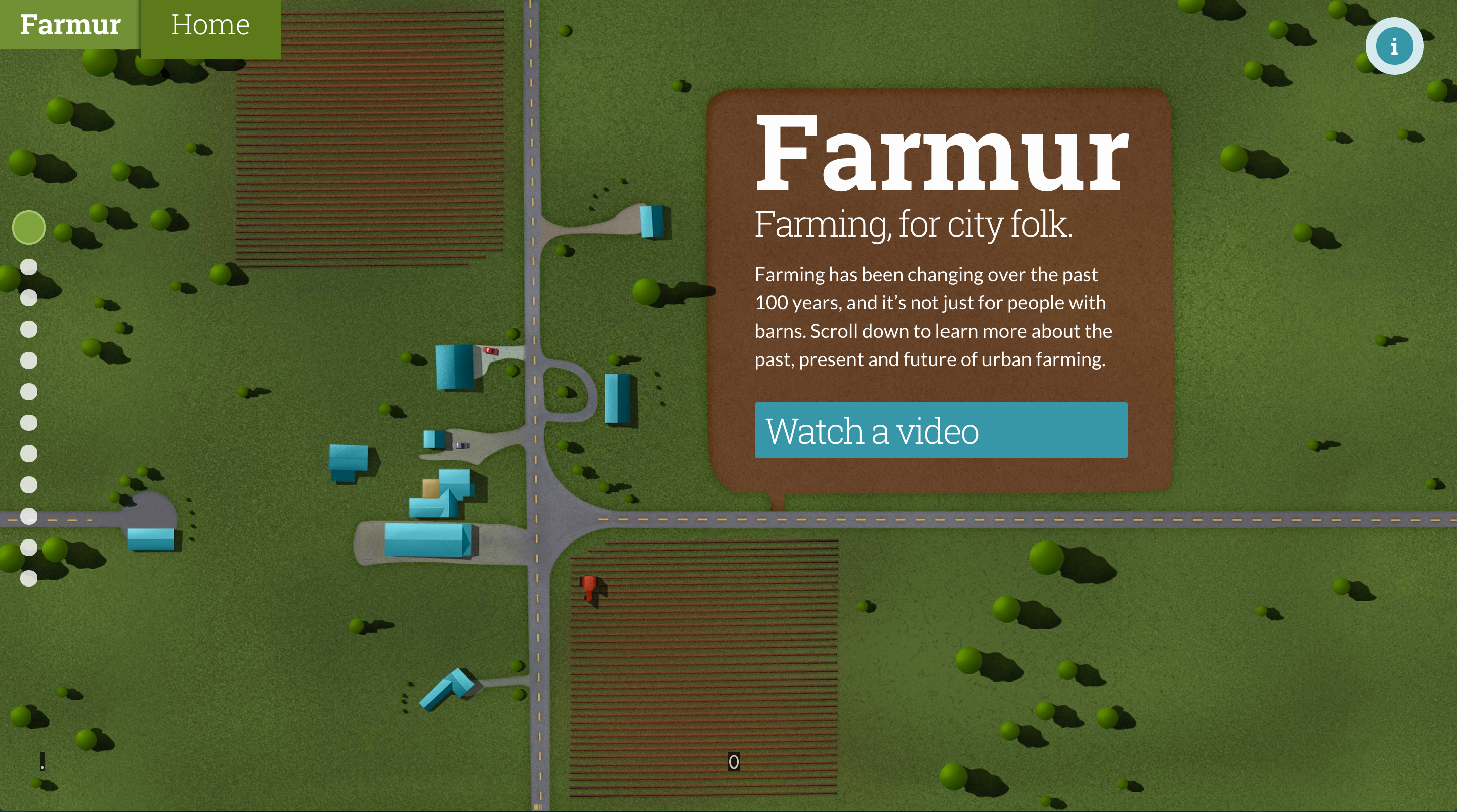
I’ve been reducing the amount of colored boxes on the page, and I introduced a new idea where the text sits in the illustration. For example, the home page now has a giant field (mostly dirt) that the logo and introduction text actually sits in.
Visual Design – Week 6
My former design, with lots of boxes and overlays is going through some updates. As I code things, I discover the need to change elements around. I also really dislike the giant color box I had originally planned for my home page. Some of the feedback I’m receiving is to let the illustrations show through more and remove boxes. I tend to agree, since the illustrations are the part that tell the visual story, and the text only supports it.