Visual Design – Week 9

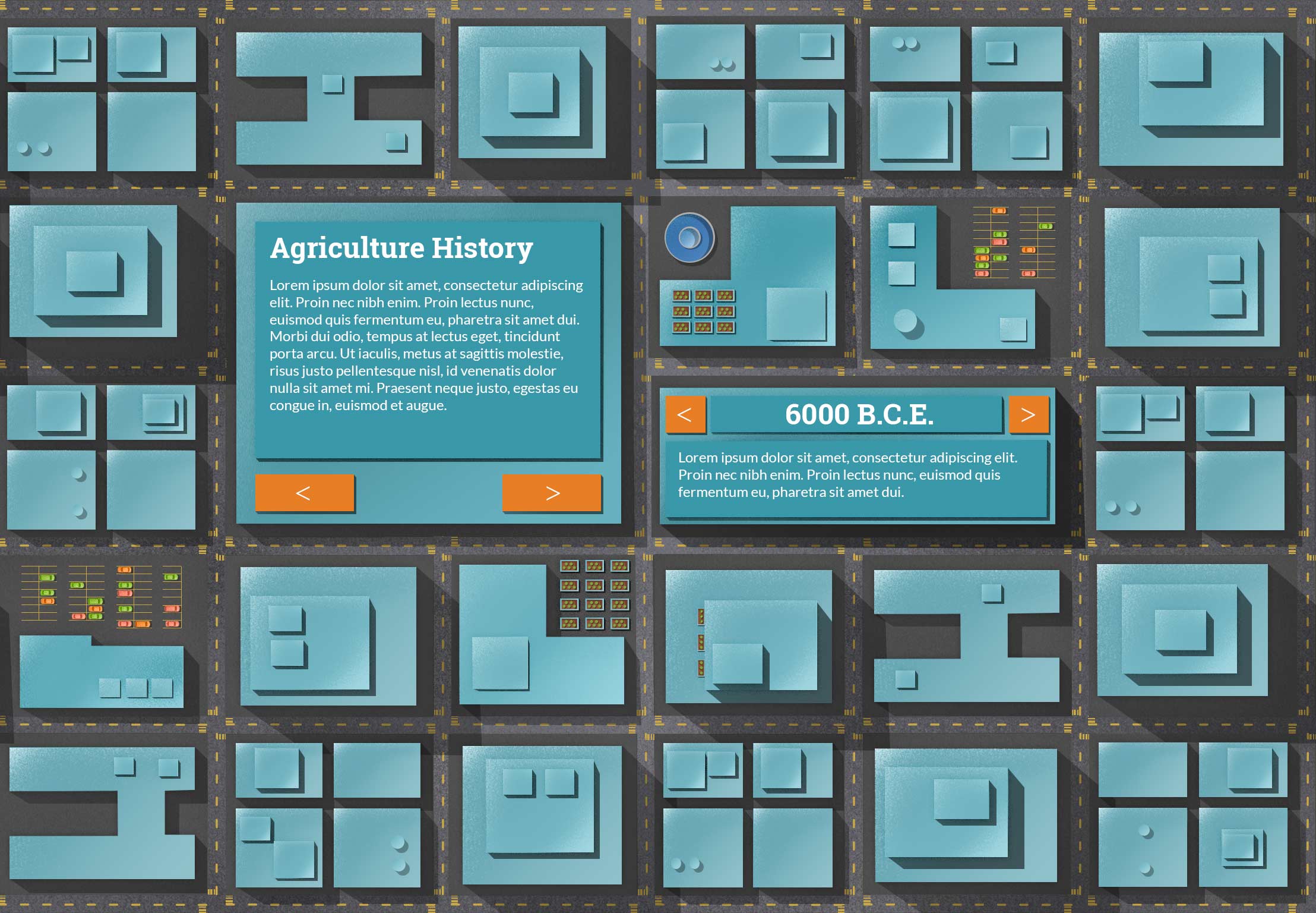
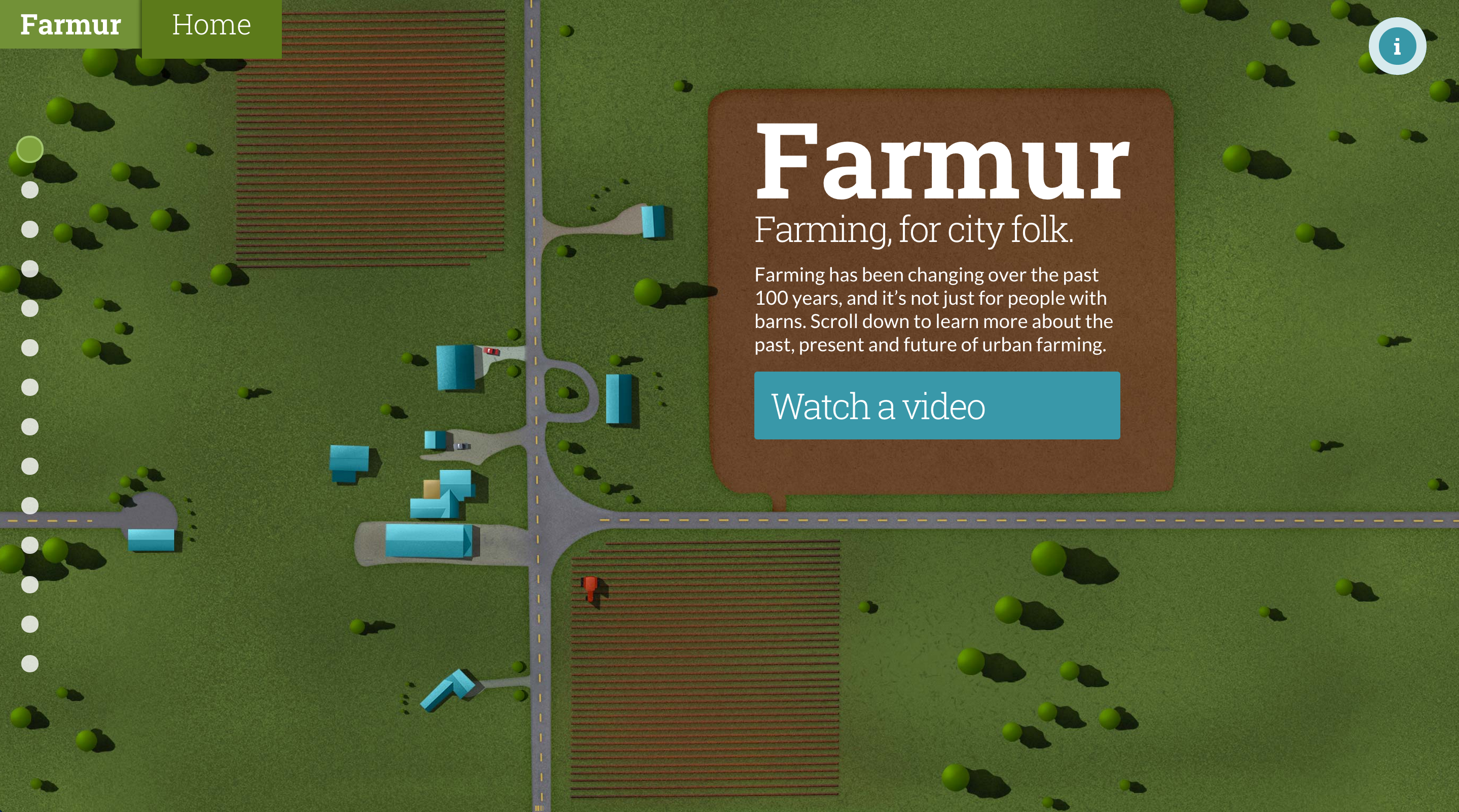
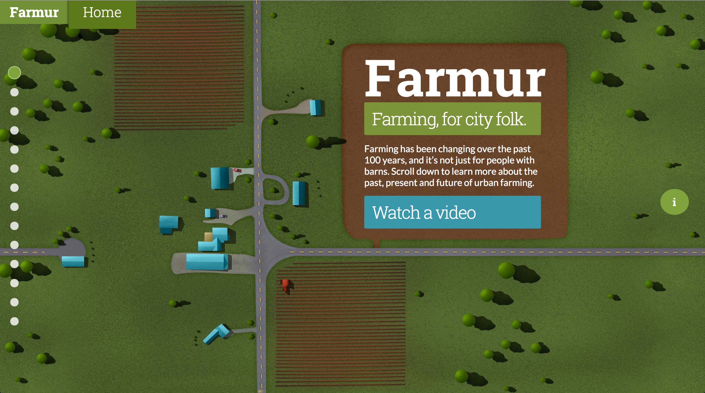
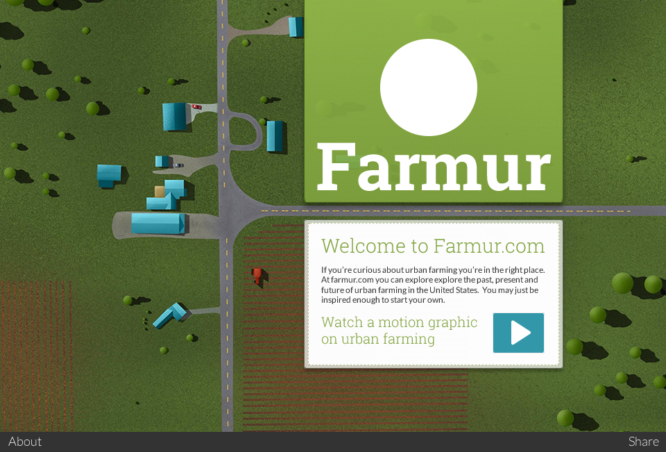
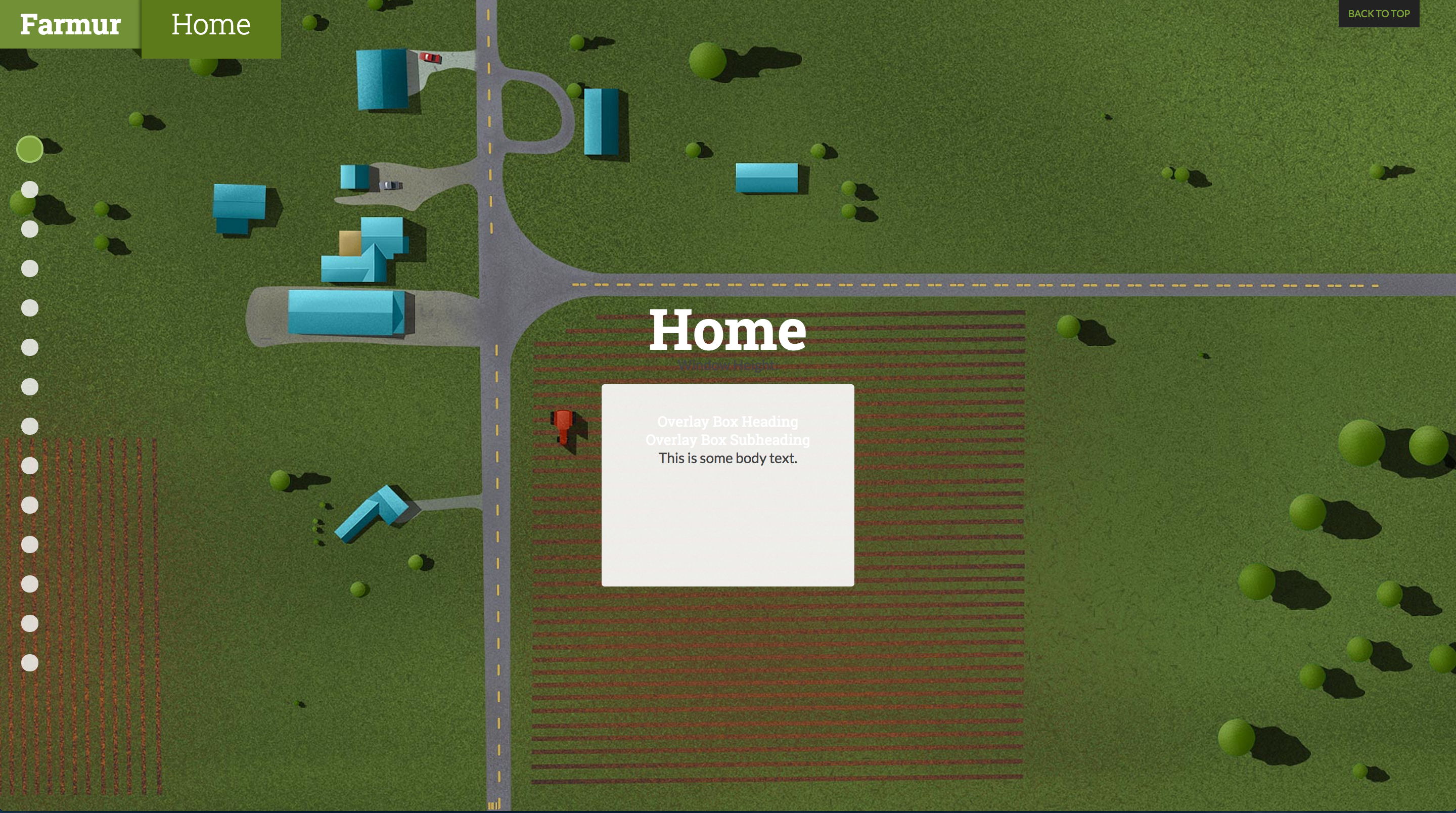
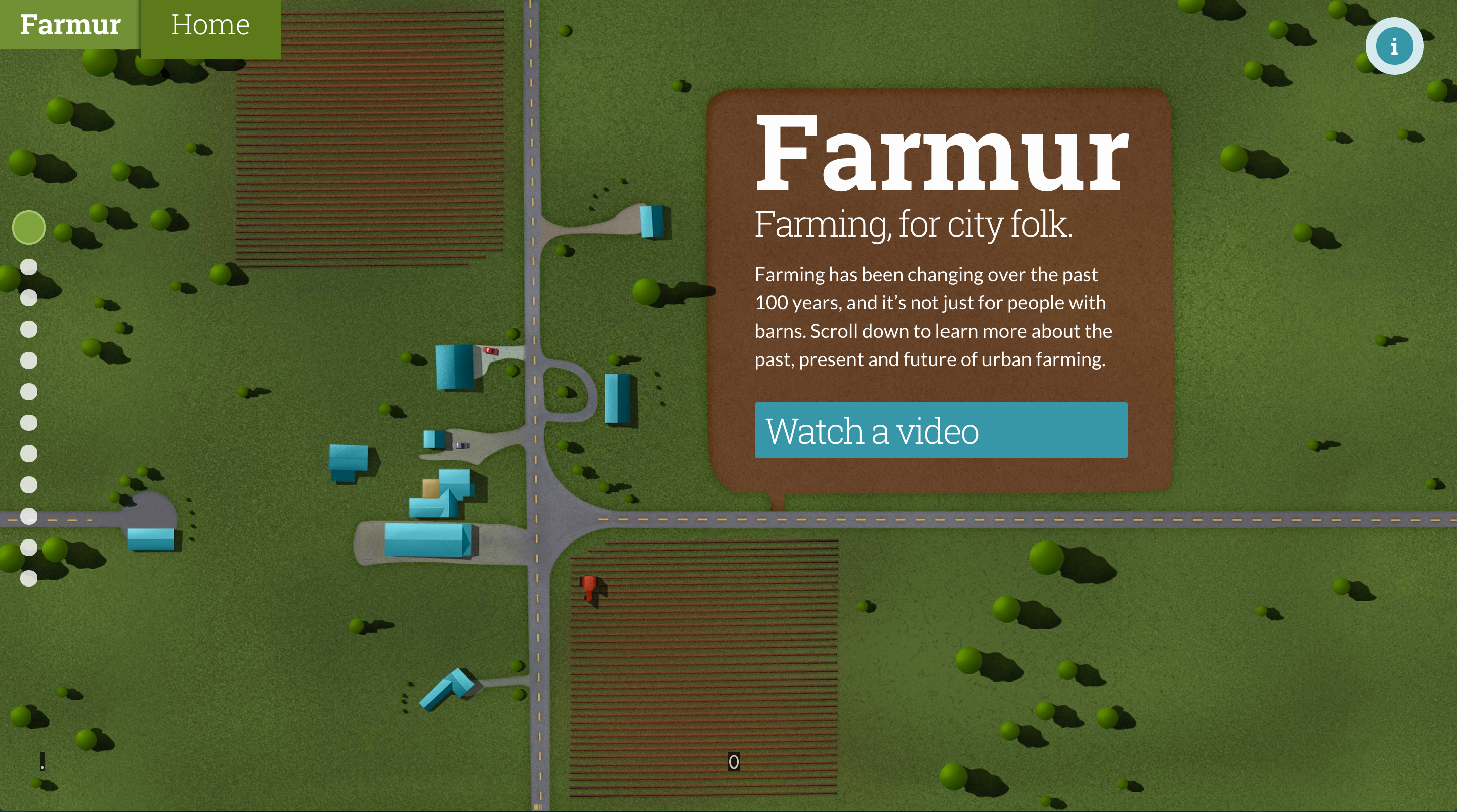
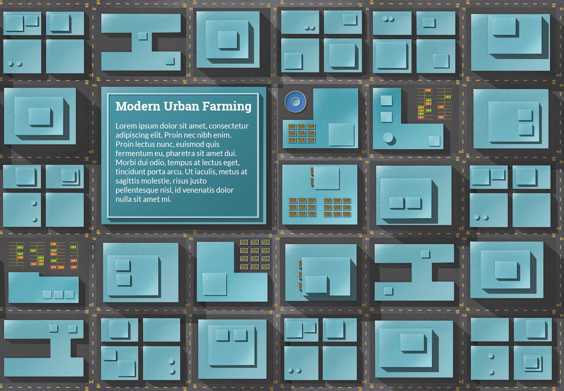
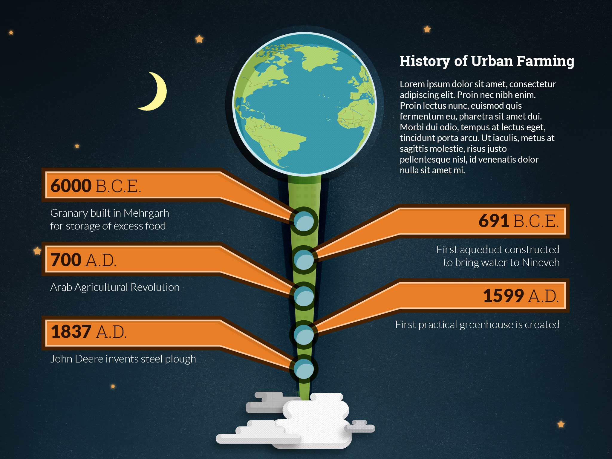
I’ve created some new pages and tightened up the side navigation.  With the navigation, the height was to long, so I decreased the space between them. On the second page with buildings I created a place where text could sit on top of a really large building and removed all the slideshow elements. The slideshow elements are now on a separate page and will provide an opportunity to animate elements when the page appears.

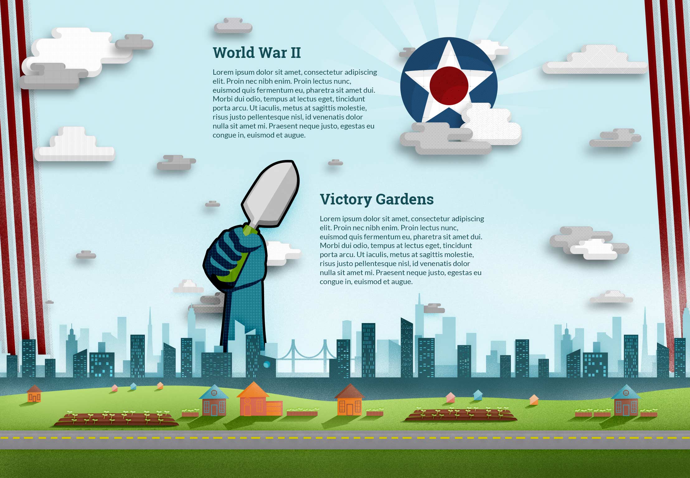
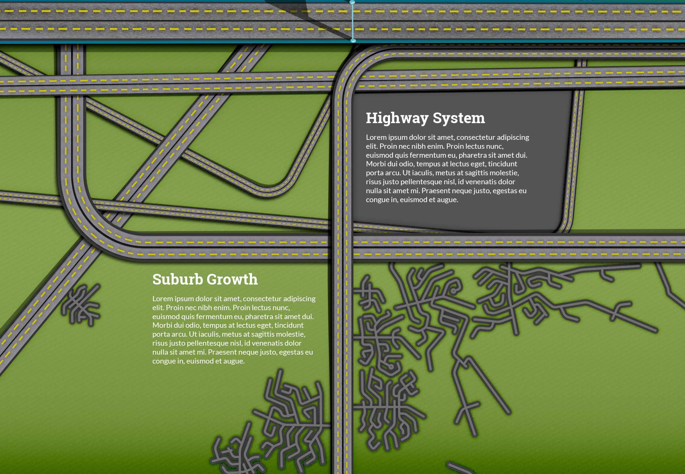
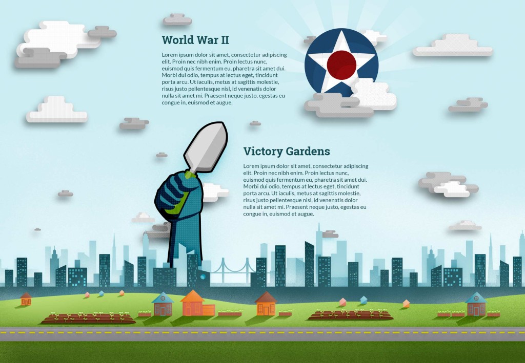
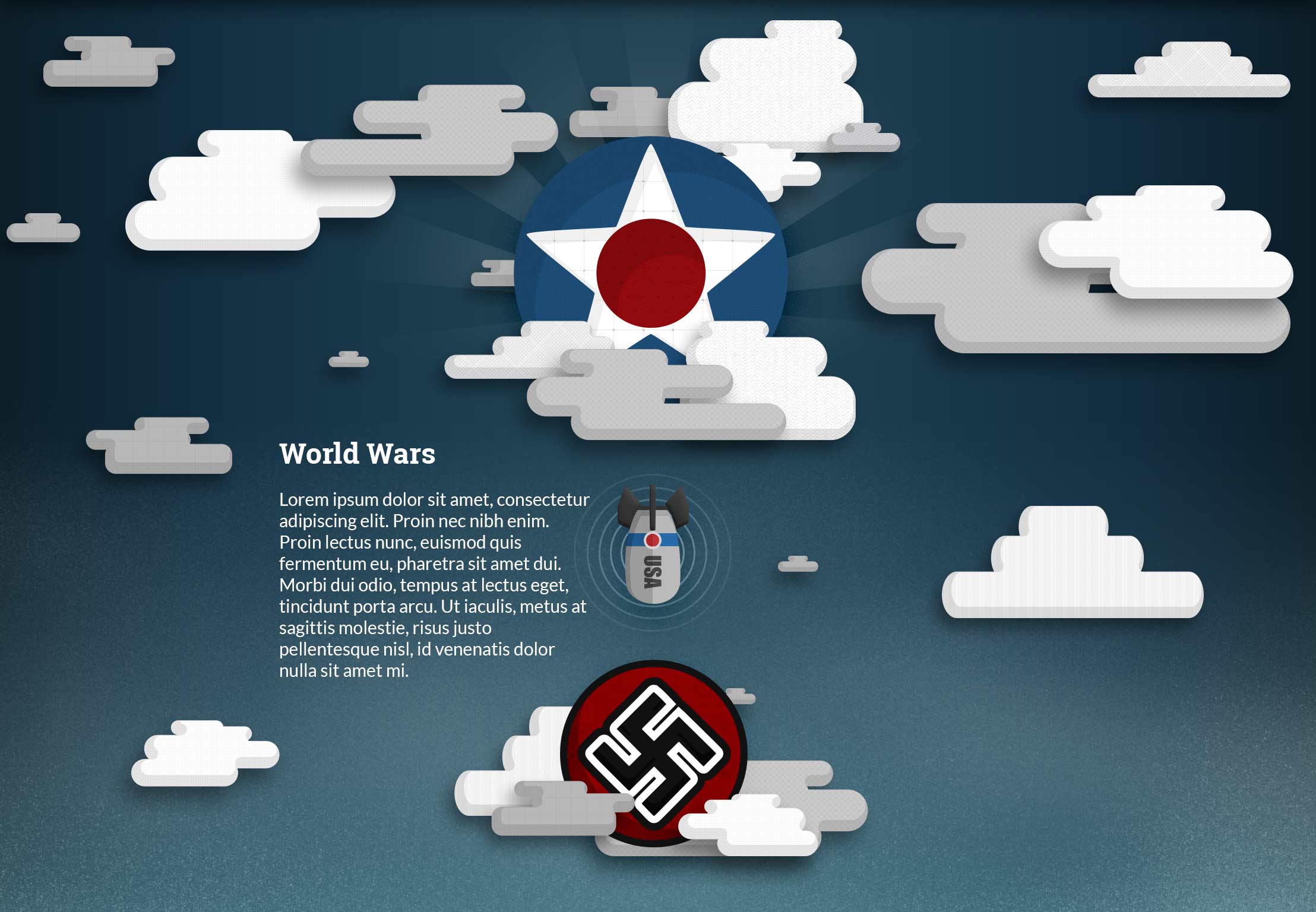
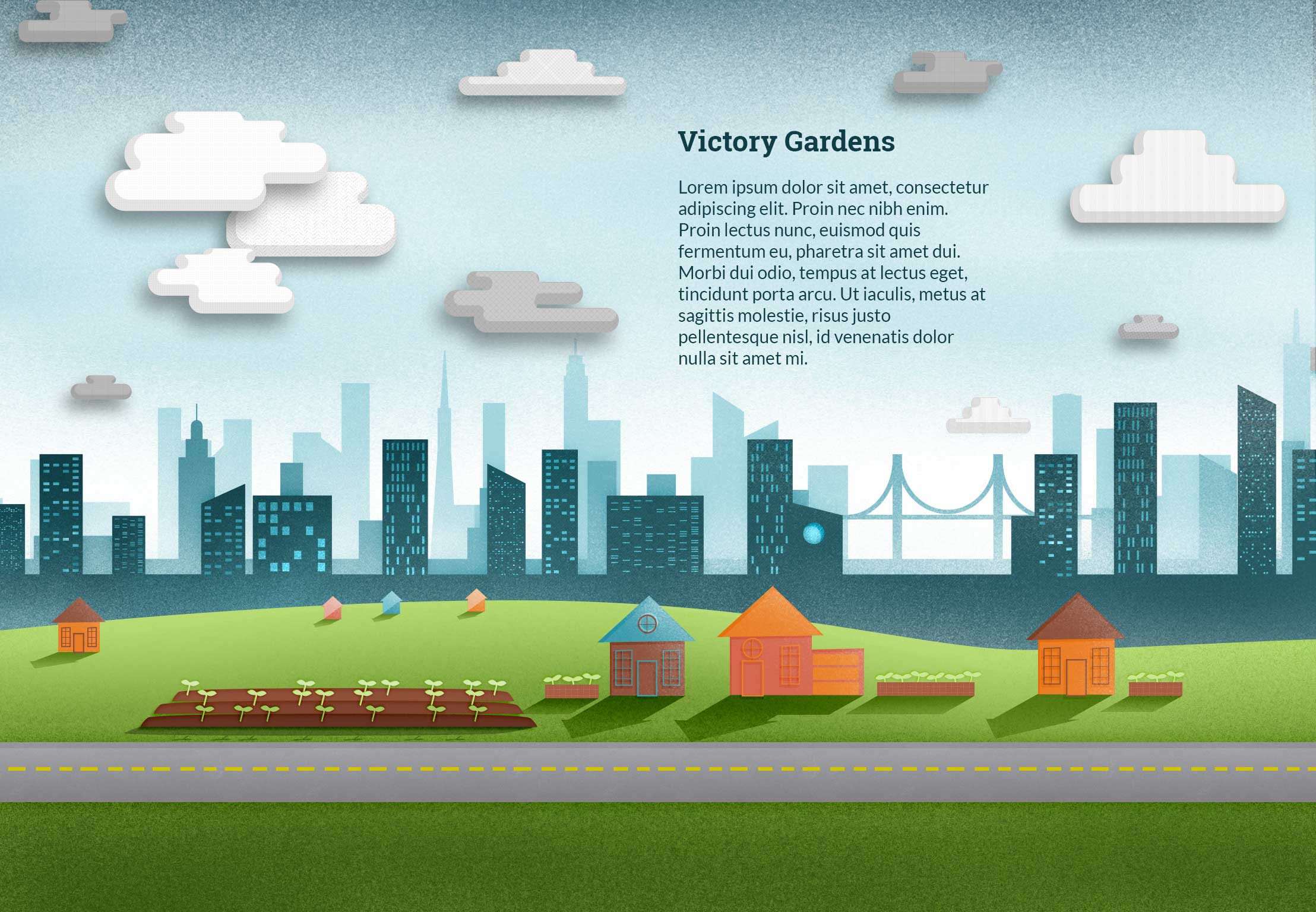
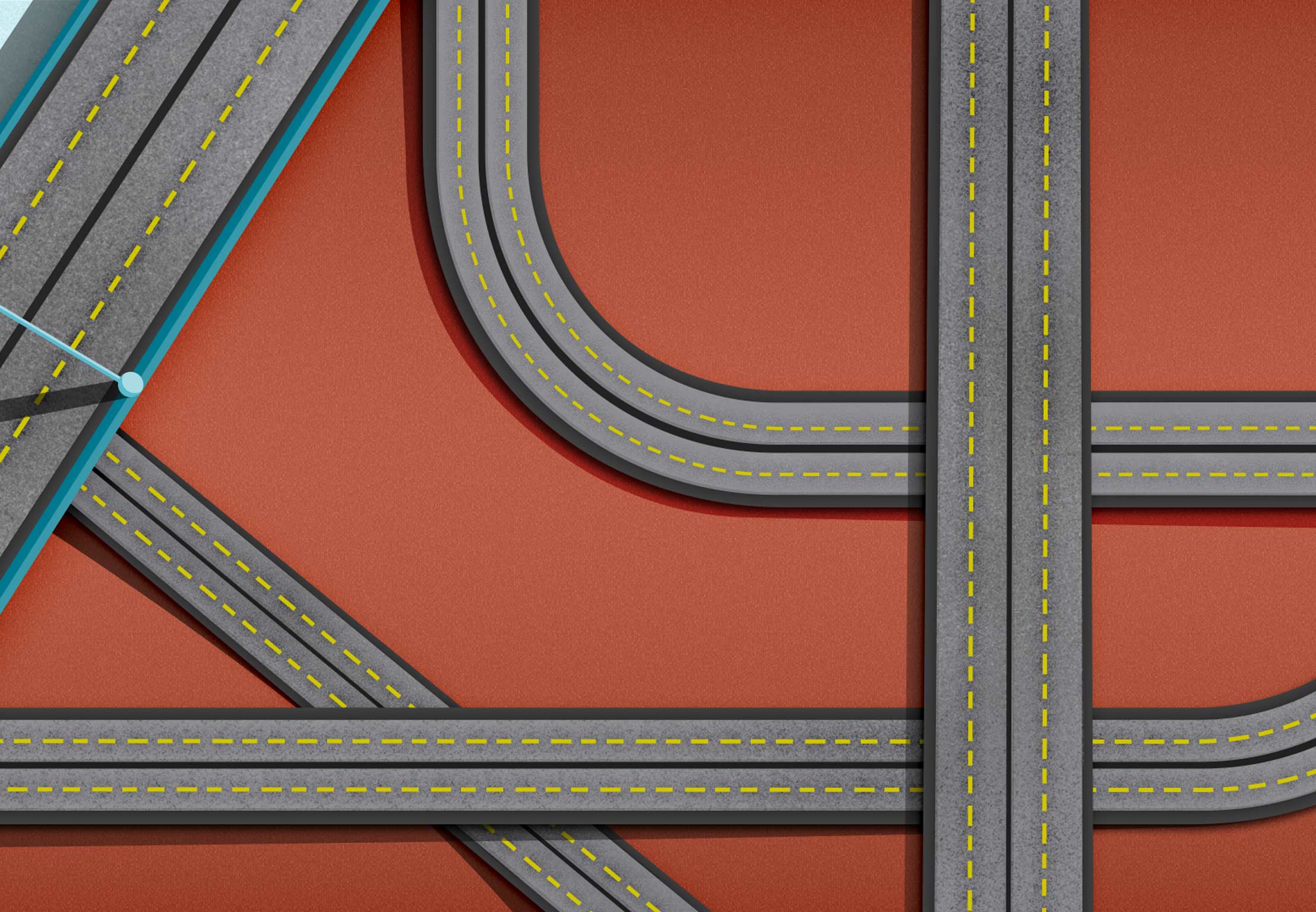
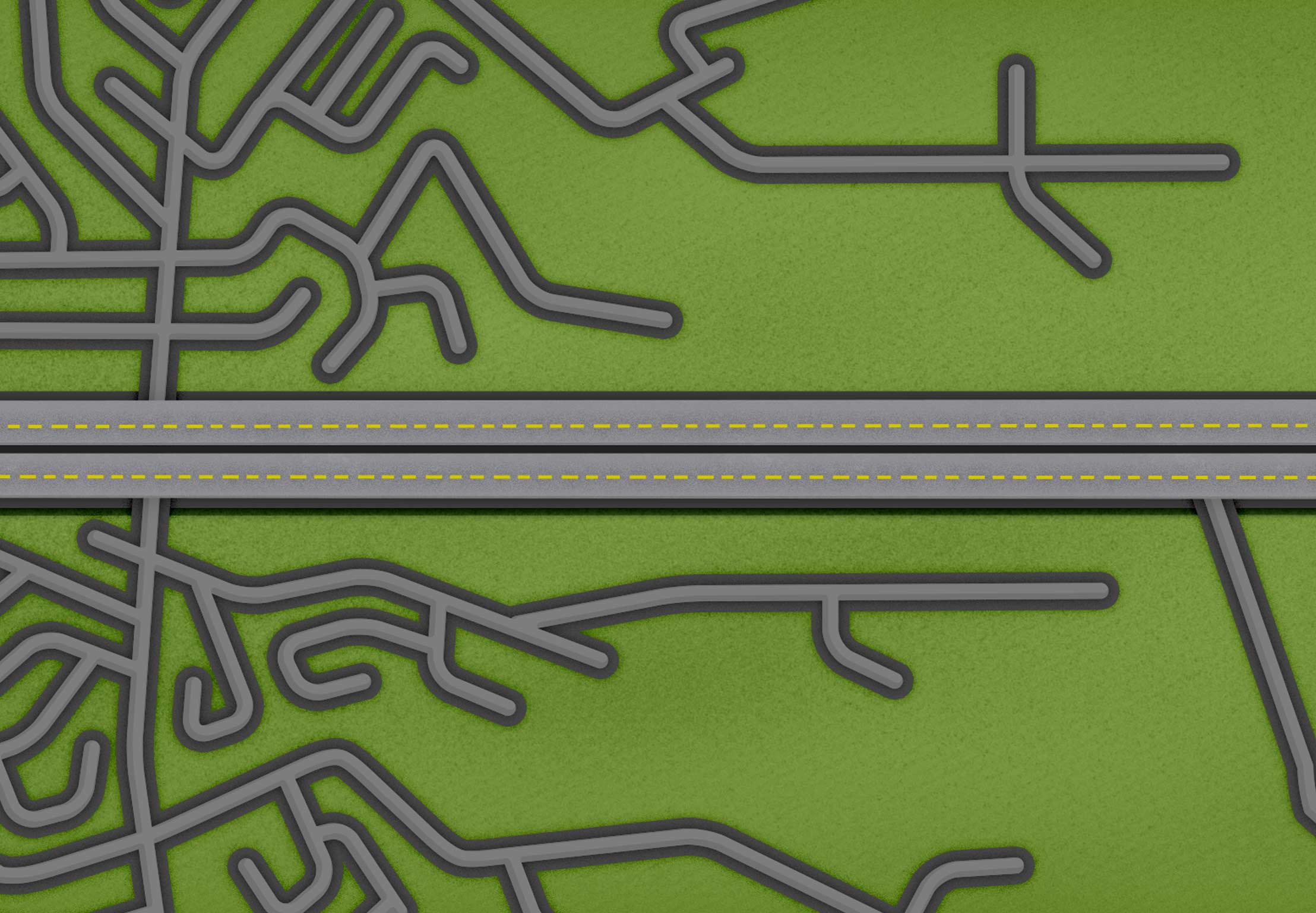
The World Wars and Victory Gardens are now separate pages and the World Wars now have a separate page. New pages include the Suburbs and Highway System.  You can see all the old designs before breaking them into separate pages at the bottom of the post.

Tightening up the design of the homepage.
Current page 2
Current page 2
Current page 3
Current page 3
Current page 5
Current page 5
Redesign of page 4 separated into pages 6 & 7
Newly separated highway section into page 7
Suburb section idea
Suburb section idea


Textures I’m using courtesy of Subtle Patterns:

light_wool textured_stripes wavegrid white_texture


Section 4 Alternate Section 5

Responsive Web – Week 8 – Swiper.js, animations, and ui feedback

This week was a big week, but it doesn’t actually look much different.  I completely changed the library that runs each slide and began getting ready to change how the user interacts with the design.  I am now using swiper.js to control movement to and from each new page.  This library allows me to move up & down but also left and right while maintaining a manageable navigation structure.  What is great about this new system is that it is very mobile friendly, and the mouse can now act like a finger to move around.  Additionally, I am able to move the user through a story in all different directions instead of a traditional down motion.  I spent a lot of time this week testing out how to move between pages with navigation and how to jump to specific pages.  You can test jumping to specific pages by tapping the “Farmur” logo in the top left while on any other page than on home.

Another cool thing I have started learning this week is GSAP (GreenSock Animation Platform).  This platform gets amazing speed when animating, and it supports many older browsers.  The biggest feature that lead me to GSAP is that it uses “requestAnimationFrame.”  This function is built to call animations even in mid animation, allowing for smooth transitions.  This function also shuts animations down when the browser tab isn’t being looked at (saving energy), and can run around 60 fps right in your browser!  I will be using this library to animate the transitions from page to page.  There is a “timeline” playhead option too that I will use to create two of my interactive infographics.

I worked on getting animations working this week too.  I refined the menu animation and added a subtle movement when a user hovers, this may be removed later though.  Another thing I worked on was the main header animation when the section changes.  Before it would fade, then snap to the right size.  Now it fades then animates the width change.

Here is the current version of the site: http://goo.gl/kDPFzk

Midterm Presentation Responsive Web

Visual Design – Week 8

In my continued attempt to integrate the type into the illustrations, I created a building/slideshow hybrid that people can eventually flip through the different text.  My thought is that I can create a fun flipping animation to look like a building flipping over in 3D space.  Actually coding this may prove to be quite the challenge.

You can see below my first attempt at the World War II & Victory Garden page, but it just doesn’t have the impact the other pages have.  Feedback I received had to do with “scale.”  I need to make things bigger because the focus is too spread out.  If I increase the size of the main focus, then it will help feel more impactful.

My saga with the homepage continues with color changes and repositioning of the “information” button.  I also changed the body font weight and removed another color box.  I think I will on have solid color elements be buttons from here on out.

Section 2 IdeaSection 3

Current home page
Current home page

Responsive Web – Week 7 – BG Images, vh/vw, and modal

This week found me focused on the resizing of text over images.  The problem I have been having is that my text is supposed to sit on my images and resize with it.  When I get the size right, the text doesn’t resize with the browser.  Here’s an example of the original version, before my solution.  The issue could be solved by creating lots of media queries, but this means a lot of extra code and a lot of visual “jumps” when as the user resizes.  My solution meant that I used a unit called, “vh.”  Here’s an example of my solution (go ahead and resize the browser).  Here’s an example of the code I used:

#home div.overlay-box > p {
    font-size: 1.5em;
    font-size: 2.4vh;
    margin-top: 12px; 
    margin-top: 2vh;
}

First I set the size for browsers that don’t support “vh” then I readjust the size utilizing the vh suffix.  If you’re interested in vh & vw check out this article. What vh does is calculate the viewport height and calculate that into units.  Each vh is worth 1% of the height, making my 2.4vh above equal to 2.4% of whatever the browser height is.  This allows me make the text appear to move with the image in the background.  In order to make the background image resize based on height, and to repeat along the x-axis I used the following code:

.container > #home {
    background-image: url(../img/01_bg.jpg);
    -webkit-background-size: auto 100%;
    -moz-background-size: auto 100%;
    -o-background-size: auto 100%;
    background-size: auto 100%;
    background-repeat: repeat-x;
    background-position: center center;
}

The last thing I did on the site was create an animated modal window that will display more information about the pages if there is any.  Currently, the “i” in the green circle along the right hand side of the screen activates he modal.  Here’s the working example.


Visual Design – Week 7

I’ve been asked to turn in my color palette so that we can all discuss it.  I’ve mentioned this before, but my thinking behind my color palette is to be “bright earthy.”  Blue is representative of the sky; green is grass and plants; orange is from plants and the sunset/sunrise; brown is dirty; and the salmon color is mostly a highlight color that rounds out the palette.

I’ve been reducing the amount of colored boxes on the page, and I introduced a new idea where the text sits in the illustration.  For example, the home page now has a giant field (mostly dirt) that the logo and introduction text actually sits in.

Color Palette


Current home page design

Responsive Web – Week 6 – Navigation, BG Images & Callbacks

This week I was able to work on the navigation a bit more.  Mainly working on some small animations to show the section title when a user mouses over the dot.

One of the major things I was able to get working was the “current” title changing when a user changes sections.  This is currently accomplished with a callback utilizing the jQuery plugin “PanelSnap.”  This plugin also allows the “active” state on the menu.

The last major test I started running was with the background-image.  I’m using:

background-size: cover;

in order to have it fill the screen.  The first two images are supposed to be continuous, so I had to add:

background-position: center bottom;"

to the image in oder to the first section in order for it to be horizontally centered and resize from the bottom.  The second section needed to resize from the top, so the code for the was:

background-position: center top;"

Finally, I looked at my site on an ipad and I’m thinking I may need to rethink having “pages” instead of true scrolling.  The ipad showed the screen vibrating, which I’m assuming is due to the height calculation.  This next week may include a lot of changes.

Here is the most updated version of the site: http://goo.gl/KR3dvS

Visual Design – Week 6

My former design, with lots of boxes and overlays is going through some updates.  As I code things, I discover the need to change elements around.  I also really dislike the giant color box I had originally planned for my home page.  Some of the feedback I’m receiving is to let the illustrations show through more and remove boxes.  I tend to agree, since the illustrations are the part that tell the visual story, and the text only supports it.

Home Page
Current planned design of homepage
Week 6 Home Page
Current home page

Responsive Web – Week 5 – Navigation, CallBacks & Centering

I spent a lot of this last week trying to get the navigation to update with an “active” class when the page is in view.  This class allows me to style the navigation differently than the rest when it is the focus.  The next thing I spent a bit of time on was absolute positioning and centering my content.  There are times when I will need items to “stick” to one area, while other times I will need items to adjust their size and position if the user adjusts the screen size.  I was able to accomplish centering by applying the utilizing the following CSS:

.overlay-center {
    position: absolute;
    left: 50%;
}
.overlay-box {
    background-color: rgba(255,255,255,.9);
    padding: 2em;
    margin: 2em;
    border-radius: 3px;
}
#home div > .overlay-box {
    position: relative;
    left: -50%;
    max-width: 350px;
    min-width: 250px;
    margin: 10px auto;
    height: 25%;
}

To this code:

<section id="home">
   <div class="overlay-center">
     <div class="overlay-box">
       <h4>Overlay Box Heading</h4>
       <h4 class="subheading">Overlay Box Subheading</h4>
       <p>This is some body text.</p>
     </div>
   </div>
 </section>

One problem I haven’t been able to solve yet is updating the header with the “current page.”  I have the plugin set up, but I can’t make it function completely—hopefully next week!  Here’s a live version of my progress:

http://goo.gl/rbK41q

Visual Design – Week 5

Still working on text placement and positioning.  I’m focusing a lot this week on making sure I have a specific size for all the pages to come.  I created a blank PSD template to help size everything exactly in the same size. I move everything into the template and export, then I create the page in code for my Responsive Web Class.

02_bg

Responsive Web – Week 4 – Pagination and Navigation

I spent a lot of time this last week researching better options for the scrolling of my site and working on the navigation.  There are two jquery plug-ins that I have been trying to work with since last week:

  1. onepage-scroll
  2. isInViewport

Onepage-scroll allows me to scroll page by page with a smooth animation between them.  I have implemented the scrolling, but the navigation is basically broken at the moment.  The following zip file contains “grid.html” and is a demonstration of the page scrolling working:

Mark Teater's Graduate AAU Thesis Journal