All posts by markteater

Responsive Web 2 – Week 2

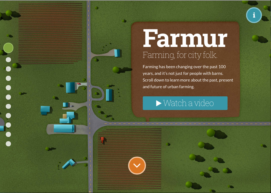
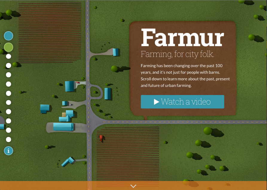
This week I focused on navigation and applying a couple suggestions from users during my user experience 2 testing.  Although I wasn’t able to finish the changes, or get to the full list I was hoping to work on, I was able to create the major structure of what the navigation will be.  First, I move the “More Information” icon from the top right over to the left and under the side pagination. This is an attempt to collect all the loose UI elements that created confusion for users.  Instead of looking all over the screen, users can start looking for major navigation elements on the left hand side.  I also added a new blue button at the start of the pages that will trigger a global menu for users.  Right now, the menu modal appears, but there is no menu.

Another change I implemented was to add in a back button.  This was a request from a user who disliked that there was no obvious way to move back.  Currently, the button goes to the last page you were on, it does not go back through through your path like a browser would.  It’s also hidden by default on desktop; a user has to hover over the page headline (top left) to reveal it.  The reason for this is that I don’t really want users jumping around.  It’s a story, you move forward through it, but if someone MUST go back they will most likely find it as they move their mouse around the screen, or try to click the logo.  I plan to add some tooltips in later that will coach people about elements like this as they become relevant.  This tooltip wouldn’t appear until the user moves off the home page.

Lastly, I added better labeling on the side navigation and added actual labels to the pagination along the bottom of some screens.  It looks back right now, since I had trouble creating my vision through CSS, but I’m hoping to get help on this in class.

Here is my most recent version of Farmur: http://farmur.com/aau/rweb2/week2/farmur.com/index.html

This is what the homepage used to look like before this week.
The most recent version of my thesis project homepage.

Responsive Web 2 – Week 1

The final class has arrived, and I’m already exhausted.  I have spent years preparing for this semester, and now that it’s here, I’m nearly ready to walk away.  It’s been a grueling year working full time and trying to find time for thesis work on top of class work.  I realized looking at the current state of my thesis project I’m going to have to start marking somethings as “complete after presentation.”  It’s just too much to wrap up in the two months ahead.  The problems is that I am coding, designing, and animating instead of doing just one of those tracks.  I wanted to be well-rounded, and it happened.  However, being more generalized and less specialized creates 2-3x the amount of work if you still want it to look good.

It looks like I might have to forgo some planned illustrations and hold of on some animations for my final presentation, but I intend to complete them even everything isn’t perfectly polished for the final presentation.  I’m hoping they will see my project as advanced far enough to be able to graduate.  Most of the direct feedback I’ve received thus far is that I should just wrap up and present—in other words, it’s good even unfinished.  I, of course, being a perfectionists, want to have everything finished when I launch it to the world.  If I really plan on doing that by presentation time though, I may have to take another week of work off.  Hopefully it won’t come to that!

Timeline & Milestones to Graduate

Responsive Web Timeline

SWOT Analysis: Farmur

Responsive Web Deliverables

User Experience 2 – Week 15

Last week of class and not really much homework.  However, I’ve been working on planning out the next few weeks before the summer semester begins.  At work, we just finished up launching our new website which I was able to apply some of class knowledge to.  It’s helpful to be working on real life issues while learning solutions at the same time, but it’s definitely busy.  I’m looking forward to implementing the changes from this class as I think it will make Farmur more useful to people.  Ultimately, if my target audience doesn’t find it useful, it’ll feel like a big waste of time—when I do something, I want to do it right!  Here’s to continuing to improve ideas and growing in along the way.

User Experience 2 – Week 14

We spent our time this week on planning out the remainder of our thesis timeline and creating a chart to represent this.  I started this timeline months ago, but I have had to repeatedly revise it since I started working full time. I honestly can’t believe how busy this year.  It is nonstop and day and night.  I knew it would be tough going into it, but I can’t ever recommend people work full time and go to graduate school.  Doing just three classes will take me the entire year of continuous classes in the evenings.  My breaks are filled with catching up on thesis project things that during the semester I couldn’t touch. This timeline reflects the current plan as I come into my final two classes — hopefully it doesn’t need to change again.

Updated Project Timeline

User Experience 2 – Week 13

Coming out of a week of testing, my focus has shifted to solutions and updates to my thesis.  One of the biggest overhauls is adding a global navigation menu as well as tweaks to the page navigation.  My major focus has been to make hopping around easier, and not locking a user into one direction.  I added better labeling, more prominent cues to next steps, and moved all the navigation items together on the left hand side.  I found that my UI elements were being scattered and I think keeping them together will help with overall confusion.

Lastly, we were asked to create a master document with that outlines our current user interface design.  This was a lot of collecting files from the class over the semester, and putting them into one document.  There is a next steps section at the end that outlines what I plan to do next.

Updated Navigation Mechanism Current User Interface Design

User Experience 2 – Week 12

More user testing this week, and a summary of all my testing from this round. The two new testers I worked with were named Greg and John.   John and Greg both are pretty harsh critics and Greg had lots of input.  Both thought the site was usable and intriguing, but both also felt a few tweaks were needed before it became very useful.  Greg thought some of the numbers were not correct, but they were straight from the US government.  After a discussion about my sources, he still disagreed that the estimated food costs for him were way off.  The truth is, I realized that my target audience probably has a tighter budget than him, and I should probably add this to my persona profiles.

One of the biggest things I learned during this round of testing was that I needed to work on my global navigation and standardize my user interface iconography a bit more.  I will have to come up with a few major solutions to fix my navigation mechanism, but I think it will make my project much more user friendly.  Some of my testers expressed that they would be hopping around and ignoring the flow I designed, so it’s going to be important to plan for this type of user.

User Testing Round 2 Summary of Usability Testing

User Experience 2 – Week 11

I performed a round of user testing this week with James, Angela, and Sarah.  I learned quite a bit already, and I’m excited to talk with my next two participants next week. James found the idea very compelling, and he was looking forward to using it more. He had a keen eye towards spotting a lot of my unfinished work and had some helpful suggestions to improve the UI. Angela had issues with navigation and moving through the actual site.  She had a few great suggestions and ideas to improve pages I hadn’t even built yet.  Sarah also had issues with the navigation and her suggestions were aimed at proper labeling and positioning.

User Testing Results Round 1

User Experience 2 – Week 10

I found myself revisiting my old user testing task list and script this week. I have performed numerous changes since this last test, but the basic ideas were still intact.  I had changed a lot of the names and rearranged pages, so I had to rethink the flow of the document. I enjoy coming up with tests like this, it helps me think about the user more clearly, even before I perform the test.  It makes the design more practical and begins measuring all the fine details.

Test Task List & Scripts

User Experience 2 – Week 9

The assignment this week was to design three screens from our thesis project.  Since I have already started this process, and been through Visual Design, I took this opportunity to show the progression from wireframe, to high fidelity prototype, to current design.  I’m still not finished with some of my visual elements, but this was a fun assignment to get a feel for progression over time.

Visual Design Assessment

User Experience 2 – Week 8

For this week’s assignment, we created storyboards, a storyboard sequence plan, and updated 3 wireframes.  The storyboards are used in the sequence plan, and the sequence plan outlines the exact steps a user would take to complete a specific task.  The feedback I received was that my storyboards should have included more “story.”  My plan is to go back and revise them to be more interesting and less step-by-step instructions.

Storyboards Wireframes Storyboard Sequence Plan