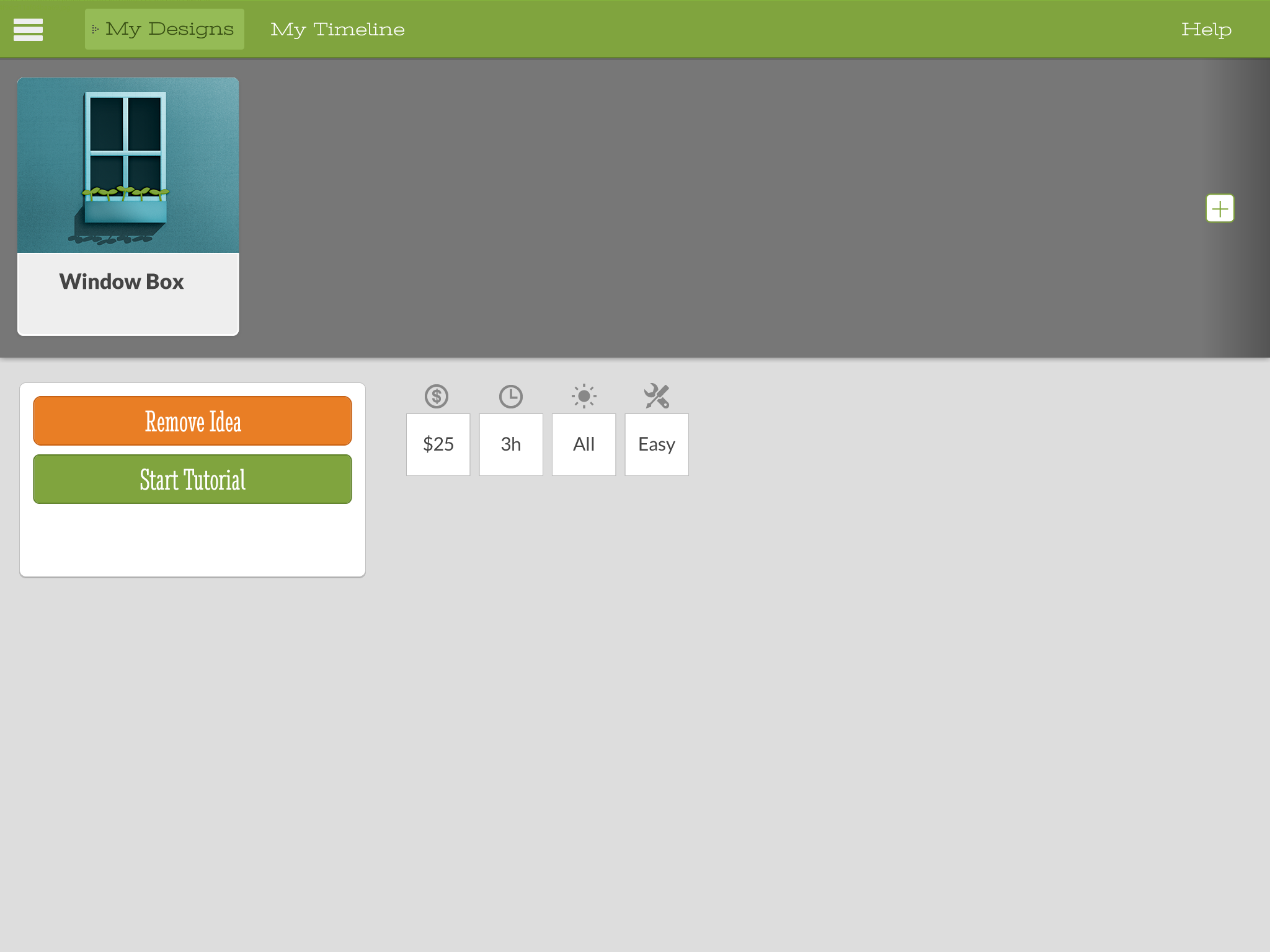
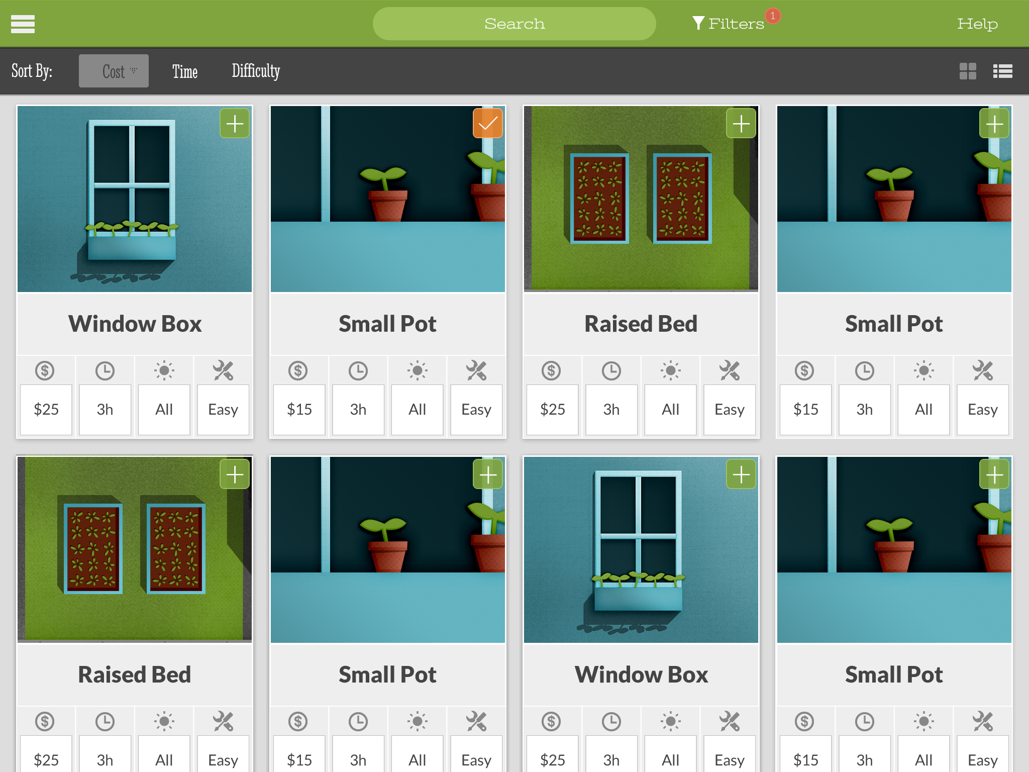
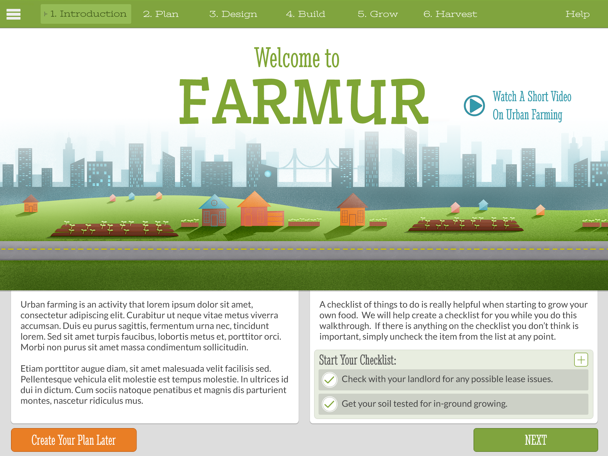
As promised, here is a working prototype of my project as it stands today. I will be running through a few rounds of user testing very soon to help guide me to what I should be fixing up and focusing on. It’s not a final site at all, so you’ll have to forgive the rough nature of it, but it will give a good sense of what the project will include and how the navigation will work. That’s it for this class!
Category Archives: User Experience 1
User Experience 1 – Week 7
There are lots of files this week, and a good number that are new. First off, we were asked to reframe what our project could be and how we could approach it. This wasn’t asking us to redo the entire semester, just to think critically about how we approached the need and if it how it could be approached differently. Next, we each presented as if we were presenting our Final Presentation to the thesis panel. This was a great exercise to get my presentation materials up to speed and I received lots of good feedback. Another thing I worked on was creating three key High Fidelity Design Specs out of the entire project. These design specs will be used in my high-fidelity prototype I will post next week. Last of the new files, we each had to create a Project Timeline and outline our goals and needs before we graduate. This is not a timeline we will be held to, it’s a timeline to help us stay on track and see where we are at.
Files that were updated include: Content Inventory v6, Personas v3, Information Architecture v9, Navigation Wireframes v8, Storyboards v4, Test Plan v5, Testing Report v2, and Usability Test Task Worsheet_v5.
User Experience 1 – Week 6
As I have been moving towards user testing I have tried to finalize my user testing plan and refine all the documents I’ve created up to this point. Early this week I created: Information Architecture v6, Navigation Wireframes v5, Storyboards, Test Plan v2, and a Usability Test Task Worsheet v2.
Later on in the week I revised a whole lot of the documents and actually performed user testing. This last part of the week I revised and created: Usability Test Task Worsheet v3, Testing Script, Testing Report, Test Plan_v3, Storyboards v2, Navigation Wireframes v6, Information Architecture v7, and my Content Inventory v4.
Late Week Documents:
Usability Test Task Worsheet v3
Early Week Documents:
Usability Test Task Worsheet v2
User Experience 1 – Week 5
Wow, so big changes this week. First, I started off with creating some high-fidelity mockups (see bottom of post) and updating the information architecture (v4). I had a good looking interface going, and I think this could be a great app someday, but after a discussion with Ryan (our program director) I was inspired to reimagine what this project could be. I redid almost all of the files from the previous weeks in a few days and created a new way of communicating this information. It’s basically going to be a one page scrolling site, and there will now be interactive infographics and an attempt to focus in on the core of the material. I reduced the personas by one, created new wireframes, updated the content inventory, updated the SSNiF Chart, created a Usability Test Task Worsheet, and completed a UX Personas Scenarios Spectrum. Lots of work this week, but I think the end product will end up being more exploratory and less formulaic.
UX Personas Scenarios Spectrum v2
User Experience 1 – Week 4
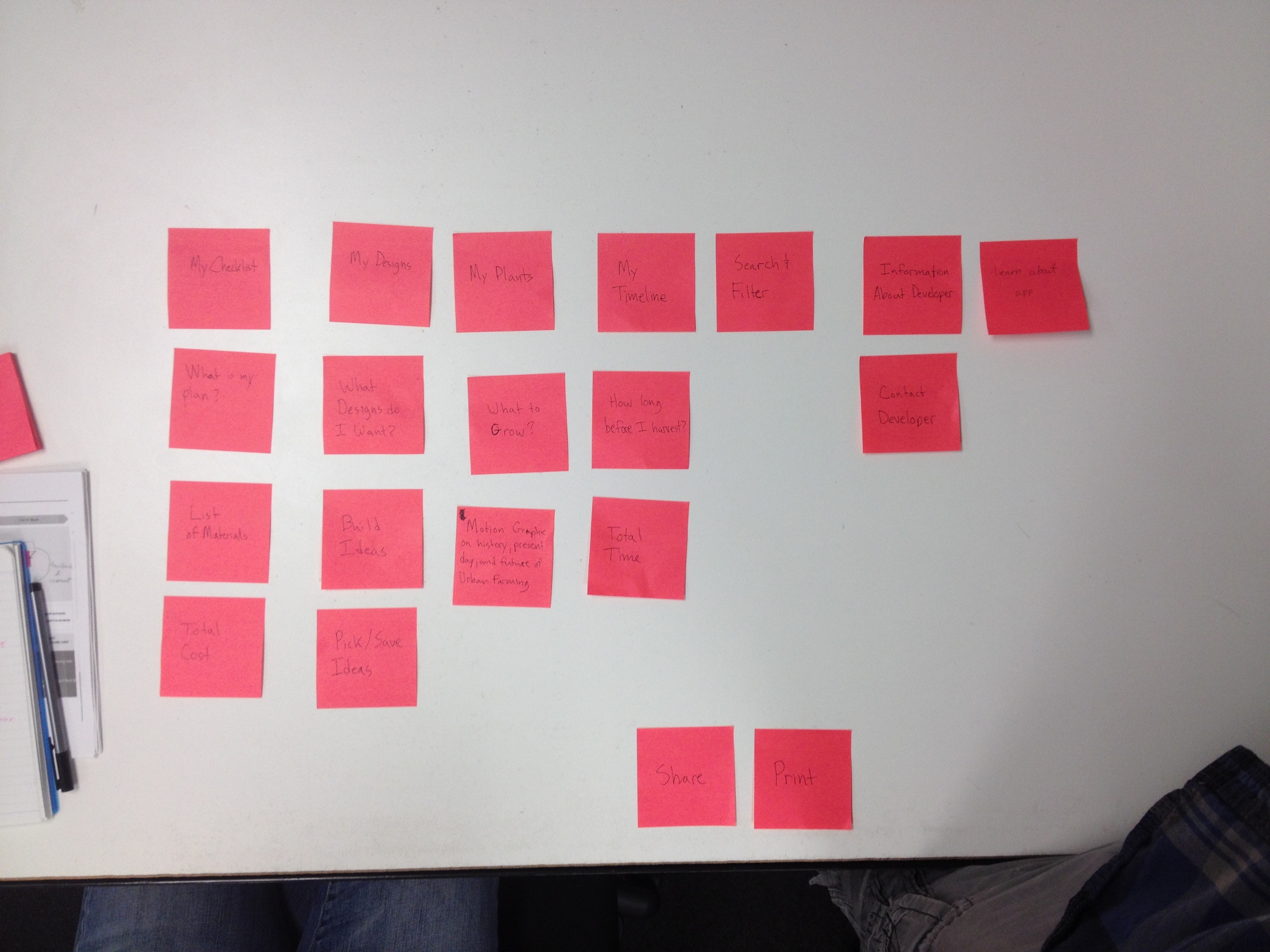
This week included card sorting with fellow class mates, a completed customer journey map, an updated information architecture, and brand new wireframes. I was a little frustrated with the card sorting exercise because I felt my class mates weren’t my target audience and they didn’t actually understand some of the words in English. Even though the card sorting didn’t go so well, I was able to gain a few points that I thought would be helpful to all users. Mostly, using possessive language like “My Plan” in some places confused people when it sub-sections included “My…” as well. My completed customer journey map shows the current state of a user who attempts to begin their own garden. It’s shows the high points and the low points, but mostly it shows the opportunities my app has to help the user out along the way. My new information architecture shows when a database of items will be needed and when storage of information to the database will be necessary. Lastly, the wireframes were created to start showing the very basic idea of what this app will be laid out like. So far it’s just been in my head, but it’s nice to finally have the skeleton in place.
User Experience 1 – Week 3
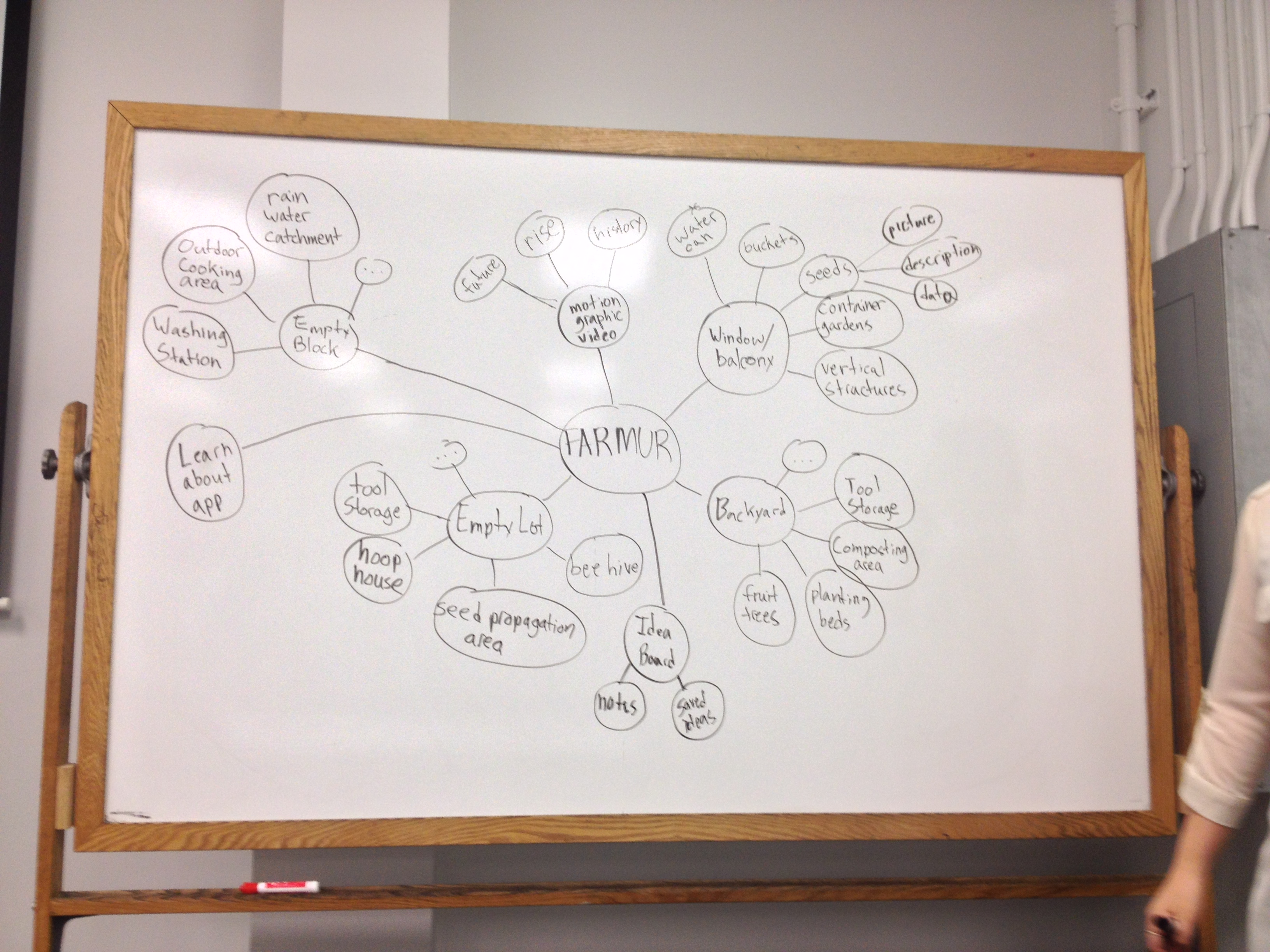
This week I created a concept map, two mind maps, started a customer journey map, and completed an information architecture. The concept map is used to help simplify and understand what my app intends to actually do, and what someone might expect to see in different sections of the app. The first mind map I created was slightly off-style from the version we were replicated so I was encouraged to redo the assignment in the exact same style. The main issue with my first version was that I wrapped the items in bubbles and instead they should be simple lines connecting lines. The second time around I was able to simplify the process and be more specific in my goals, so it worked out. My incomplete customer journey map is posted just to show I;m making progress on it, but I was discuss it more next week. My information architecture shows exactly where someone will find the different items in my app. I have four main sections: Get Started, My Plan, Idea Board, and About the App.

User Experience 1 – Week 2
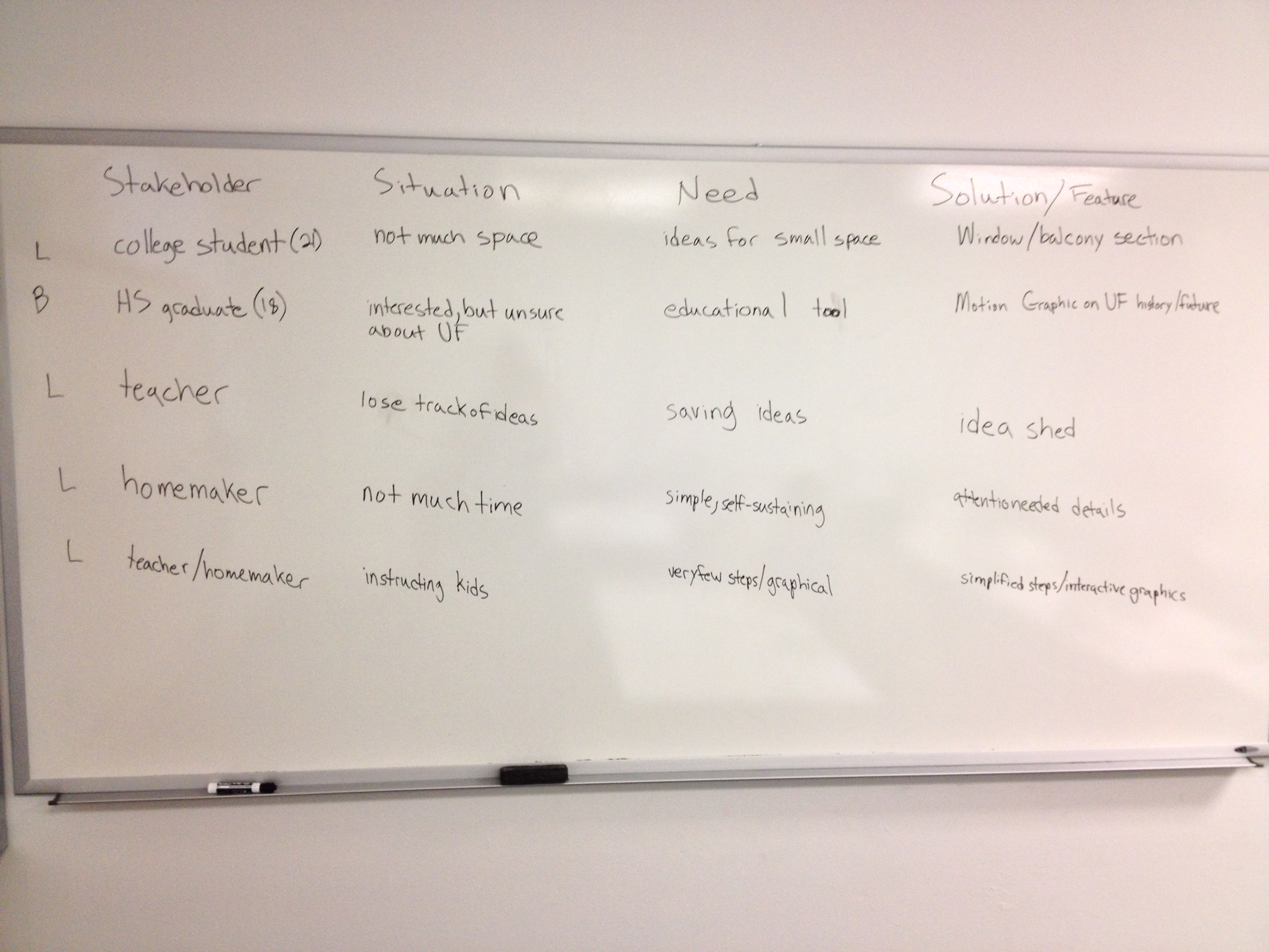
This week we spent our time on creating a SSNif chart, content map, persona list, and content inventory. My stakeholders include: a high school graduate, a middle school teacher, a homemaker, and a college student. My four personas are: Sarah Fennema (26), Althea Kemmer (30), Nick Smith (22), and Darryl Gilland (19). My content inventory includes lots of items, but some of them aren’t actually needed for the final thesis project. The “…” on the content map illustrate that there is more than could be listed on the white board.
wpid-teater_mark_UX_Personas_Scenarios_Spectrum-2013-06-22-13-20.pdf
wpid-teater_mark_farmur_SSNiF_charts-2013-06-22-13-20.pdf
User Experience 1 – Week 1
The first week of User Experience 1 has been about reviewing my thesis project thus far, and performing interviews with potential users. I was asked to turn in my feedback from the Midpoint review panel as well as all the files I turned in at Midpoint. This is a summer class that will be twice the speed of regular classes. Final Project Work Assessment Worksheet Midpoint Review Thesis Project Book Midpoint Review Panel Feedback Mark Teater – Sarah Interview Mark Teater – Angela Interview